shape_plot(my_results,
           col.x = "risk_factor",
           xlims = c(15, 30),
           ylims = c(-0.25, 0.5),
           xlab = "BMI (kg/m\u00B2)",
           add = list(end = theme(axis.title.x = element_text(colour = "red"))))
Unicode characters can be included in text by using the Unicode escape sequence (see the Quotes help file for some infomration ). Use \unnnn or \Unnnnnnnn for 4 or 8 digit Unicode hex codes. Some useful characters are:
| ≤ | Less-than or equal to | \u2264 |
| ≥ | Greater-than or equal to | \u2265 |
| ² | Superscript 2 | \u00B2 |
| ₂ | Subscript 2 | \u2082 |
| 𝛘 | Mathematical bold small chi | \U1D6D8 |
| ꭓ | Latin small chi | \uAB53 |
| μ | Greek small mu | \u03BC |
| σ | Greek small sigma | \u03C3 |
| ρ | Greek small rho | \u03C1 |
| Δ | Greek capital delta | \u0349 |
Axis titles in shape_plot() plots use the element_text theme element. Their formatting can be adjusted by adding an appropriate theme to the plot.
shape_plot(my_results,
col.x = "risk_factor",
xlims = c(15, 30),
ylims = c(-0.25, 0.5),
xlab = "BMI (kg/m\u00B2)",
add = list(end = theme(axis.title.x = element_text(colour = "red"))))
The theme element could also be changed, for example to element_marquee() from the marquee package. This allows some markdown syntax and styling.
shape_plot(my_results,
           col.x = "risk_factor",
           xlims = c(15, 30),
           ylims = c(-0.25, 0.5),
           xlab = "**BMI** (kg/m{.sup 2 })",
           add = list(end = theme(axis.title.x = marquee::element_marquee())))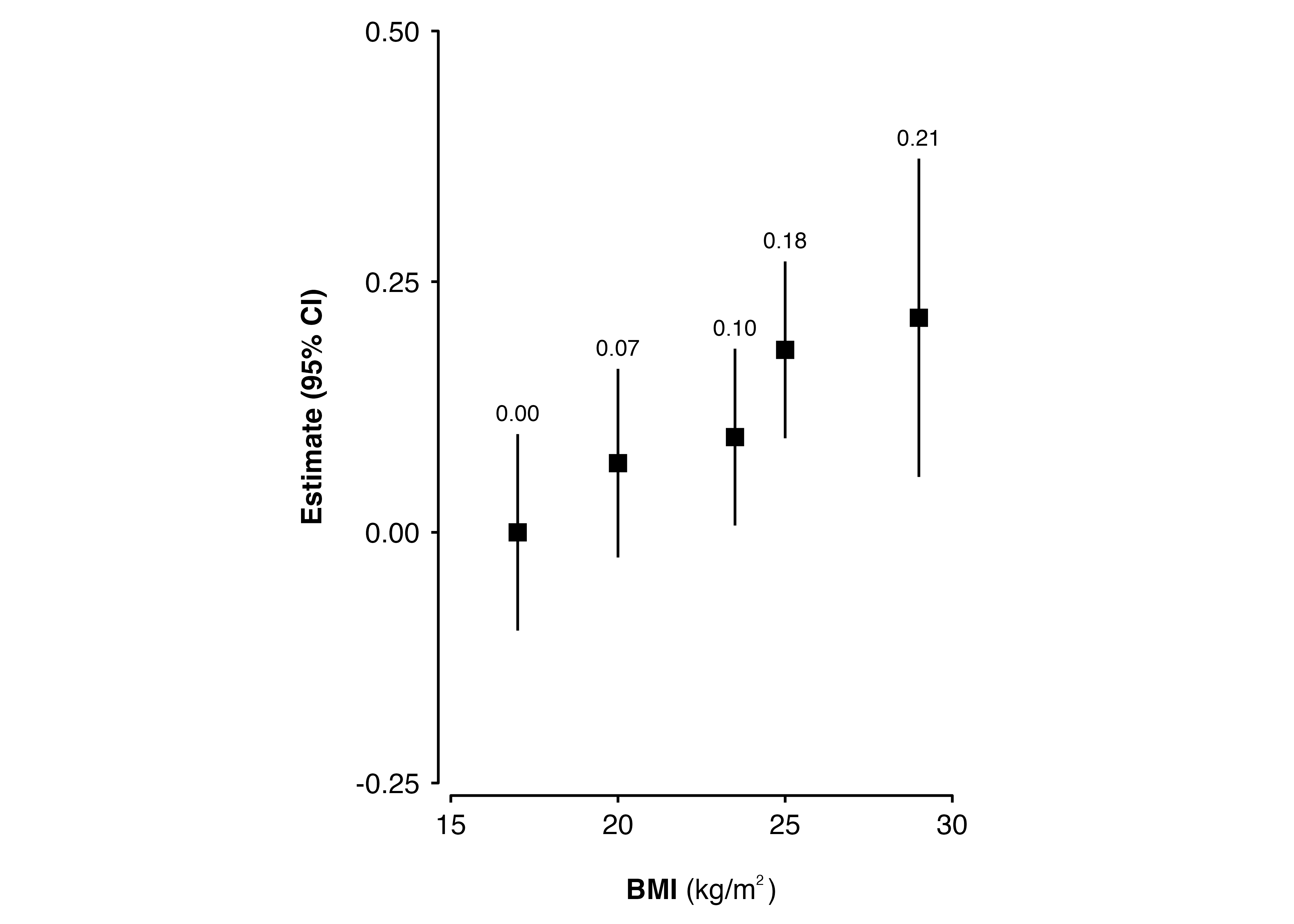
From ckbplotr v0.12.0, forest_plot() row labels use element_marquee() from the marquee package (unless changed by the row.labels.element argument). So the markdown syntax and styling available in the marquee package can be used.
new_row_labels <- data.frame(
  subgroup = c("men", "women",
               "35_49", "50_64", "65_79"),
  group    = c("Sex", "Sex",
               "Age", "Age", "Age"),
  label    = c("{.blue Men}", "{.orange Women}",
               "35 - 49 *years*", "50 - 64", "65 - 79")
)

forest_plot(my_results,
            col.key = "subgroup",
            row.labels = new_row_labels)
The x-axis title in a forest_plot() plot is created by geom_text_move() which takes the same arguments as geom_text(). To change the formatting of the axis title use xlab in the addarg argument.
forest_plot(my_results,
            col.key = "subgroup",
            row.labels = row_labels,
            addarg = list(xlab = c("size = 5", "colour = 'darkred' ")))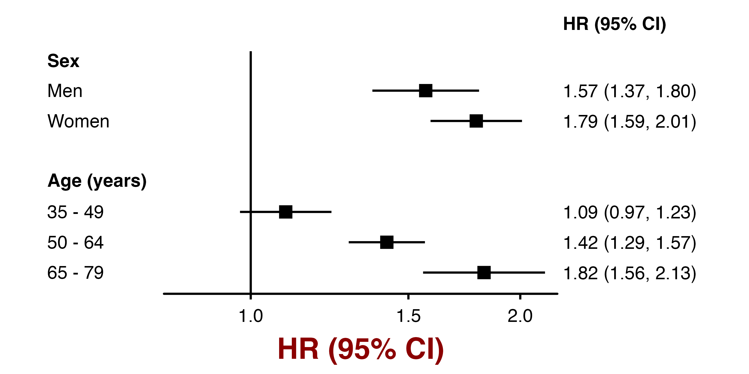
The columns in a forest_plot() plot are created by geom_text_move() which takes the same arguments as geom_text(). To change formatting use col.right, heading.right, col.left and heading.left in the addaes and addarg arguments.
forest_plot(my_results,
            col.key = "subgroup",
            row.labels = row_labels,
            addarg = list(heading.right = c("colour = 'darkblue', angle = -10")))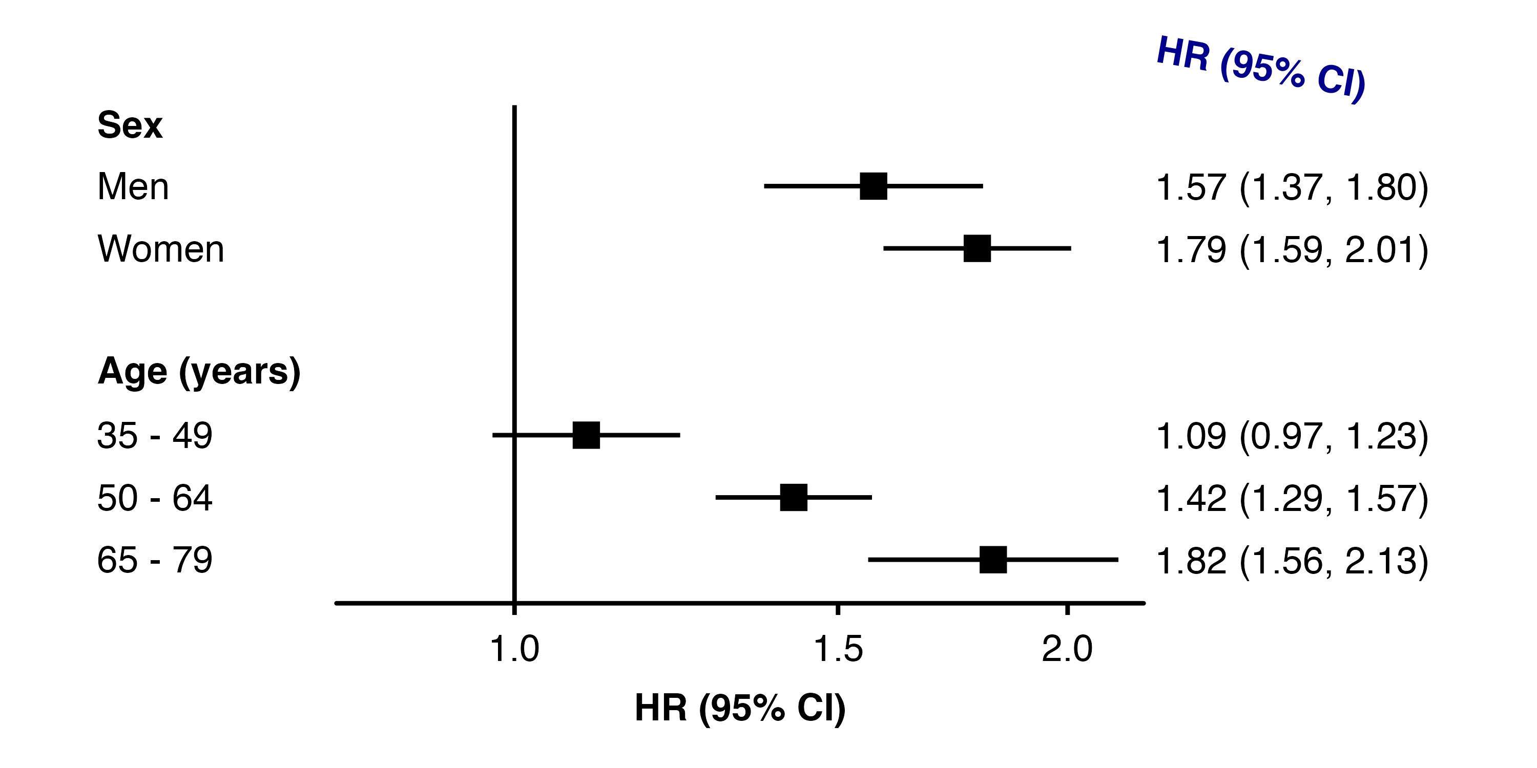
The left.parse and right.parse arguments of forest_plot() can also be used to make the columns or headings parsed into expressions and displayed as plotmath.
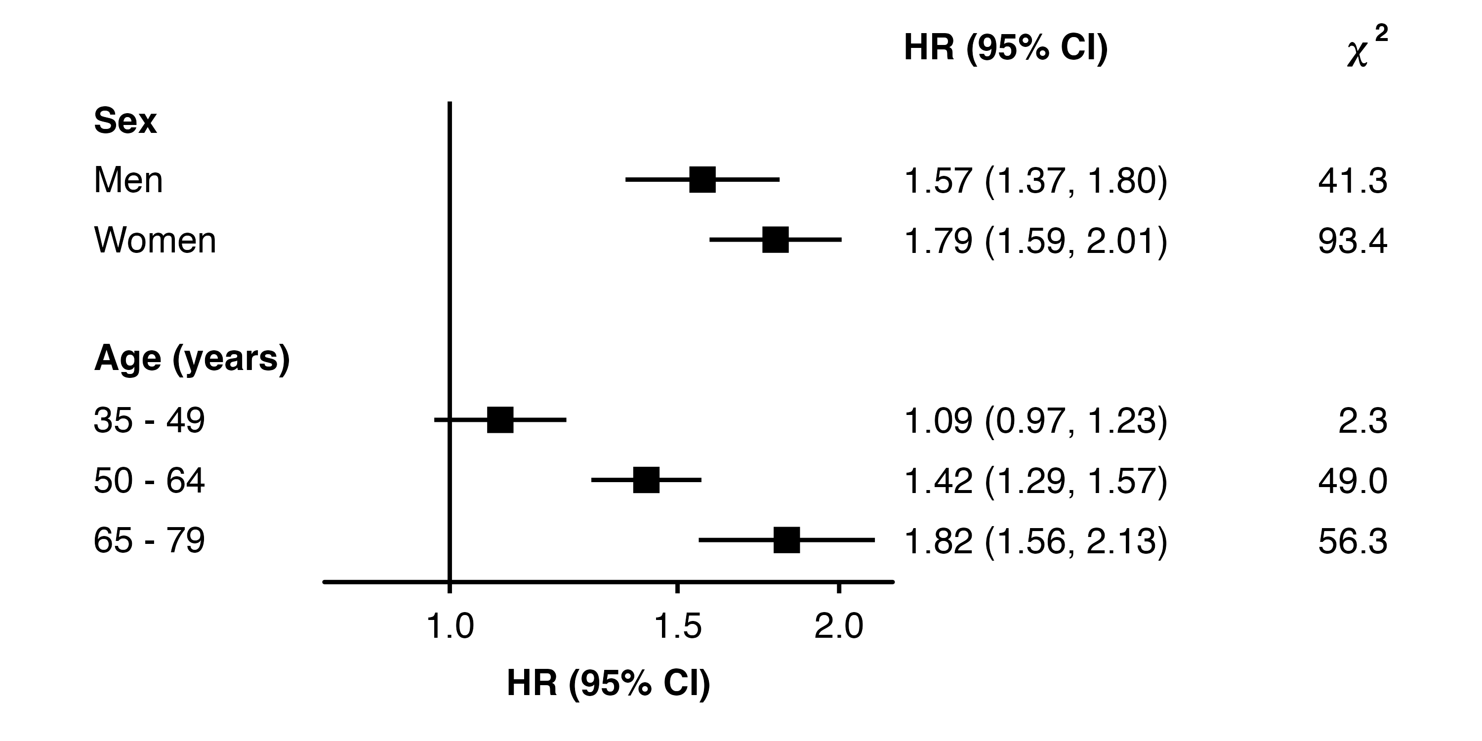
forest_plot(my_results,
            col.key = "subgroup",
            row.labels = row_labels,
            col.right = "chisq",
            right.hjust = c(0, 1),
            right.heading = c("HR (95% CI)", "bold('\U1D6D8'^'2')"),
            right.parse = c("", "heading"))