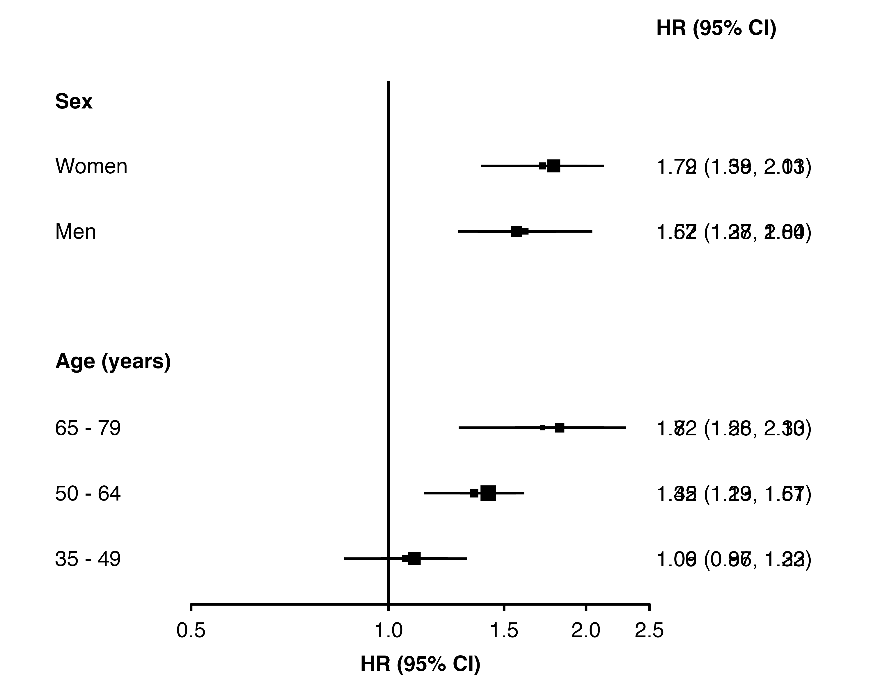
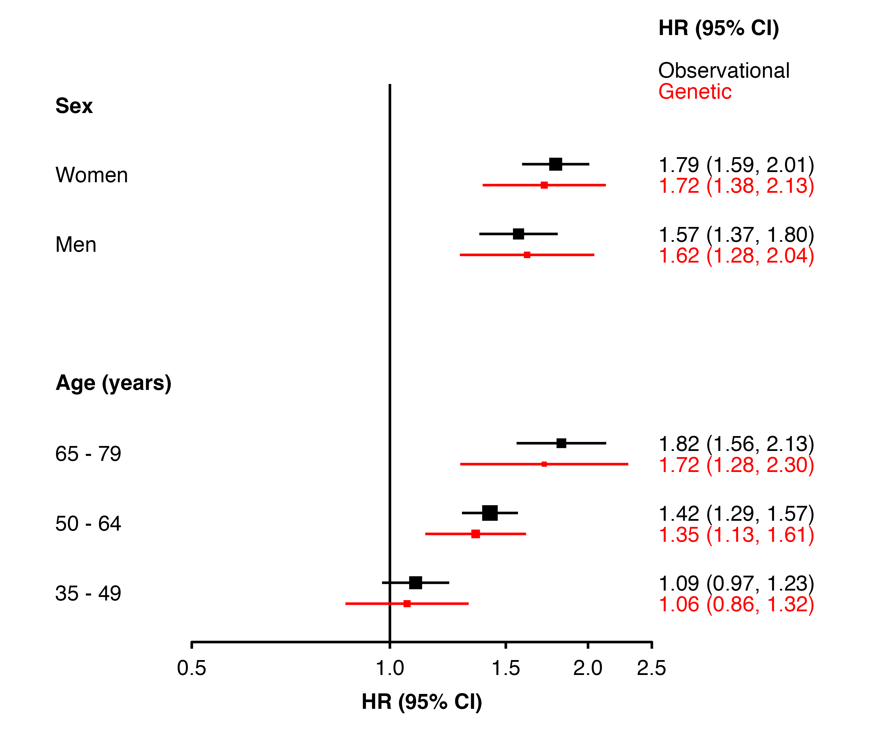
You can use the colour and addaes arguments to change the colour of points and text for different estimates. Then also create a function that will adjust the row position, and supply the name fo the function to the data_function argument. (Use the col.keep argument so that the data will contain any additional columns needed.)
# create 'mycolour' column, according to analysis typemy_resultsAB <- dplyr::mutate(my_resultsAB,mycolour = dplyr::if_else(analysis =="Observational","black","red"))# function to decrease/increase 'row' for Observational/Geneticmove_rows <-function(datatoplot){ datatoplot <- dplyr::mutate(datatoplot,row = dplyr::if_else(analysis =="Observational", row -0.15, row +0.15))## add rows to the data frame to create annotations datatoplot <- dplyr::add_row(datatoplot,auto_estcolumn =c("Observational","Genetic"),row =c(0.5, 0.8),panel ="1",mycolour =c("black", "red"))return(datatoplot)}# add the col.keep, colour, data.function, and addaes argumentsforest_plot(my_resultsAB,col.key ="subgroup",row.labels = row_labels,scalepoints =TRUE,col.keep ="analysis",colour ="mycolour",data.function ="move_rows",addaes =list(col.right ="colour = mycolour"))