library(metafor)
dat <- escalc(measure="OR", ai=tpos, bi=tneg, ci=cpos, di=cneg,
              data=dat.bcg, slab=paste(author, year, sep=", "))

dat$se <- sqrt(dat$vi)
dat$study <- paste(dat$author, dat$year, sep = ", ")

res <- rma(measure="OR", ai=tpos, bi=tneg, ci=cpos, di=cneg,
           method = "FE",
           data=dat.bcg, slab=paste(author, year, sep=", "))
dat <- dplyr::add_row(dat,
                      study = "Overall",
                      yi = res$beta[[1,1]],
se = res$se)16 Meta-analysis forest plot
This post is an example of using the forest_plot() function from ckbplotr to create a forest plot for a meta-analysis.
16.1 Meta-analysis data
First, we use functions escalc() and rma() from the {metafor} package to create a data frame of results from a meta-analysis of the dat.bcg data.
We now have a data frame that contains all of the estimates (column ‘yi’) and their standard errors (‘se’), and a unique identifier for each row (‘study’).
dat[,c("study", "yi", "se")]
                        study      yi         se
1               Aronson, 1948 -0.9387 0.59759932
2      Ferguson & Simes, 1949 -1.6662 0.45621529
3       Rosenthal et al, 1960 -1.3863 0.65834116
4     Hart & Sutherland, 1977 -1.4564 0.14252864
5  Frimodt-Moller et al, 1973 -0.2191 0.22792933
6       Stein & Aronson, 1953 -0.9581 0.09952520
7      Vandiviere et al, 1973 -1.6338 0.47645532
8            TPT Madras, 1980  0.0120 0.06330057
9      Coetzee & Berjak, 1968 -0.4717 0.23869881
10      Rosenthal et al, 1961 -1.4012 0.27463016
11       Comstock et al, 1974 -0.3408 0.11191574
12   Comstock & Webster, 1969  0.4466 0.73086399
13       Comstock et al, 1976 -0.0173 0.26764737
14                    Overall -0.4361 0.04226546
16.2 A forest plot
Using the forest_plot() function we can create a plot of the study and overall estimates. By default the function assumes estimates are on a log scale (e.g. log odds ratio, log hazard ratio) and uses a log scale for the horizontal axis.
1forest_plot(dat,
2            col.estimate = "yi",
3            col.stderr   = "se",
4            col.key      = "study",
5            xlim         = c(0.05, 8),
6            xticks       = c(0.1, 0.5, 1, 2, 4, 8),
7            xlab         = "OR (95% CI)",
8 panel.width = unit(60, "mm"))- 1
- Data frame of results.
- 2
- Name of column containing estimates (log odds ratios).
- 3
- Name of column containing standard errors of estimates.
- 4
- Name of column with unique identifier for each row.
- 5
- Limits for the x-axis.
- 6
- Tick mark locations for x-axis.
- 7
- Label for x-axis (and column of estimates).
- 8
- Width of plot panel (this ensures that CIs narrower than their points chnge colour so they can still be seen.)
16.3 Scaling point size
To have points plotted so that their area is proportional to the inverse variance, we can set scalepoints = TRUE and use pointsize to set the maximum size of points.
forest_plot(dat,
            col.estimate = "yi",
            col.stderr   = "se",
            col.key      = "study",
            xlim         = c(0.05, 8),
            xticks       = c(0.1, 0.5, 1, 2, 4, 8),
            xlab         = "OR (95% CI)",
            scalepoints  = TRUE,
            pointsize    = 8,
            panel.width  = unit(60, "mm"))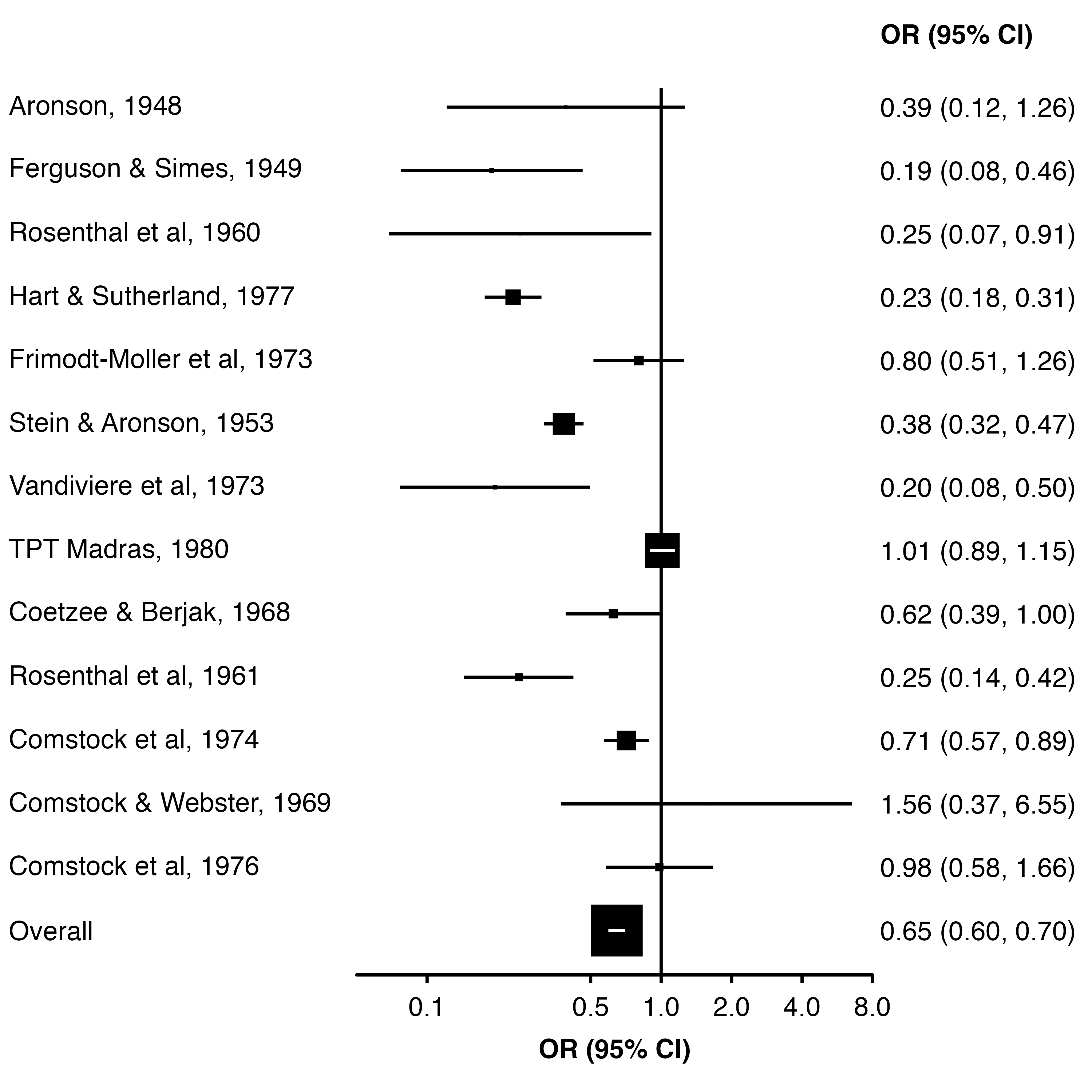
To set the point size from data, we can use col.keep (to keep a column in the plot data) and addaes (to set the side length of the points proportion to that column value).
Here, we calculate the appropriate size (side length) as the square root of the weight, after scaling them so that the largest weight is one. Then, the area of each square will be proportional to the study weight.
dat$weight <- c(weights(res), NA)
dat$point_size <- sqrt(dat$weight / max(dat$weight, na.rm = TRUE))

forest_plot(dat,
            col.estimate = "yi",
            col.stderr   = "se",
            col.key      = "study",
            xlim         = c(0.05, 8),
            xticks       = c(0.1, 0.5, 1, 2, 4, 8),
            xlab         = "OR (95% CI)",
            scalepoints  = TRUE,
            pointsize    = 6,
            panel.width  = unit(60, "mm"),
            diamond      = "Overall",
            bold.labels  = "Overall",
            col.keep     = "point_size",
            addaes       = list(point = "size = point_size"))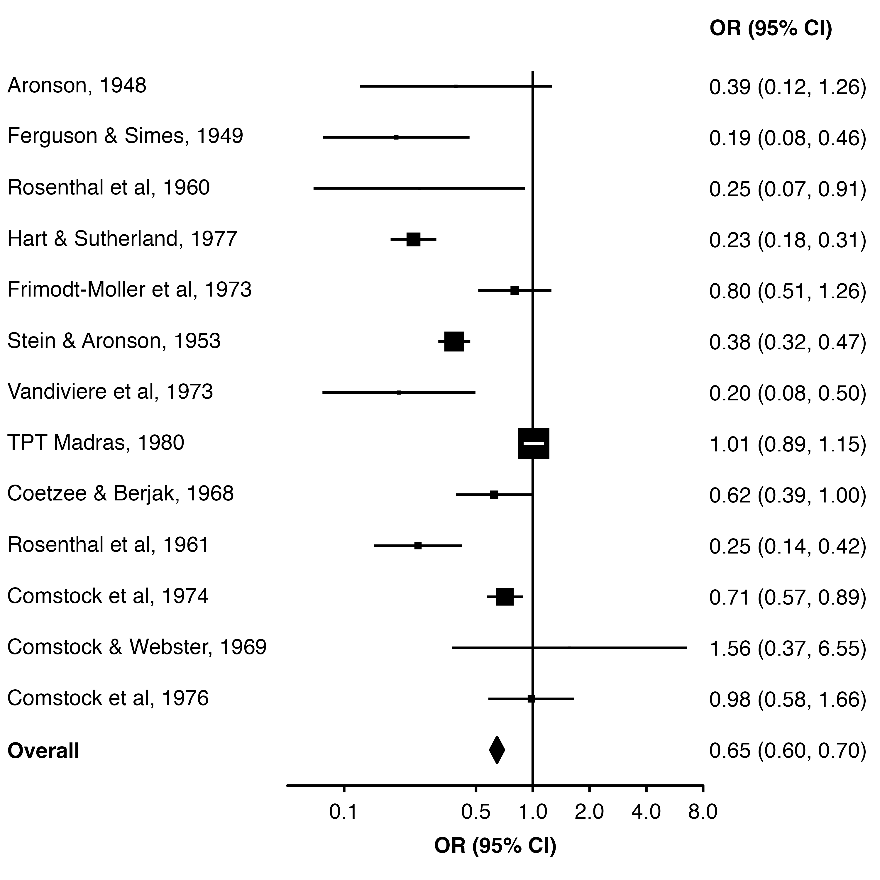
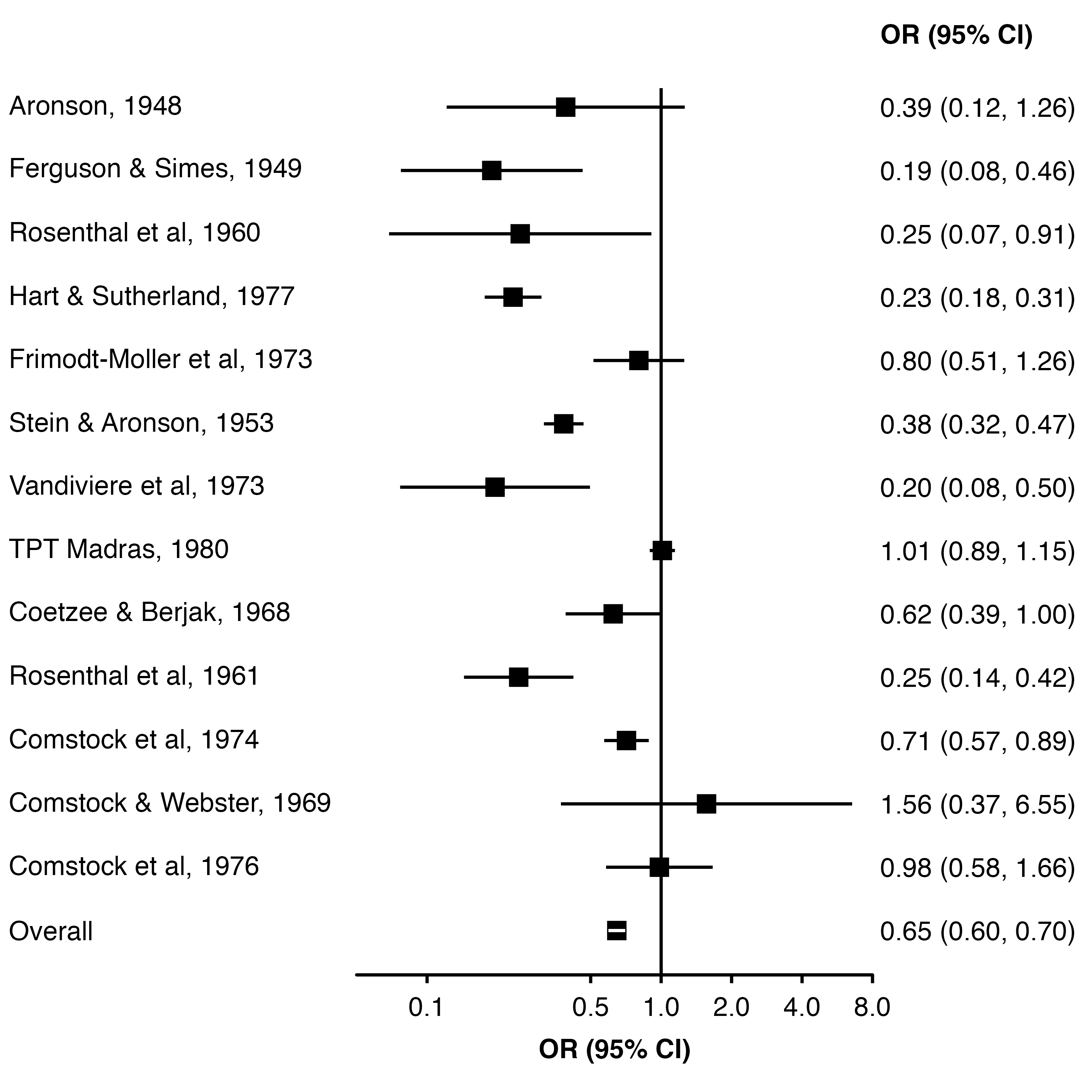
16.4 Diamond
To have the overall estimate appear as a diamond we can use the diamond argument (and use bold.labels to make the row label bold). These need to be equal to the relevant value in the col.key column.
forest_plot(dat,
            col.estimate = "yi",
            col.stderr   = "se",
            col.key      = "study",
            xlim         = c(0.05, 8),
            xticks       = c(0.1, 0.5, 1, 2, 4, 8),
            xlab         = "OR (95% CI)",
            scalepoints  = TRUE,
            pointsize    = 8,
            panel.width  = unit(60, "mm"),
            diamond      = "Overall",
            bold.labels  = "Overall")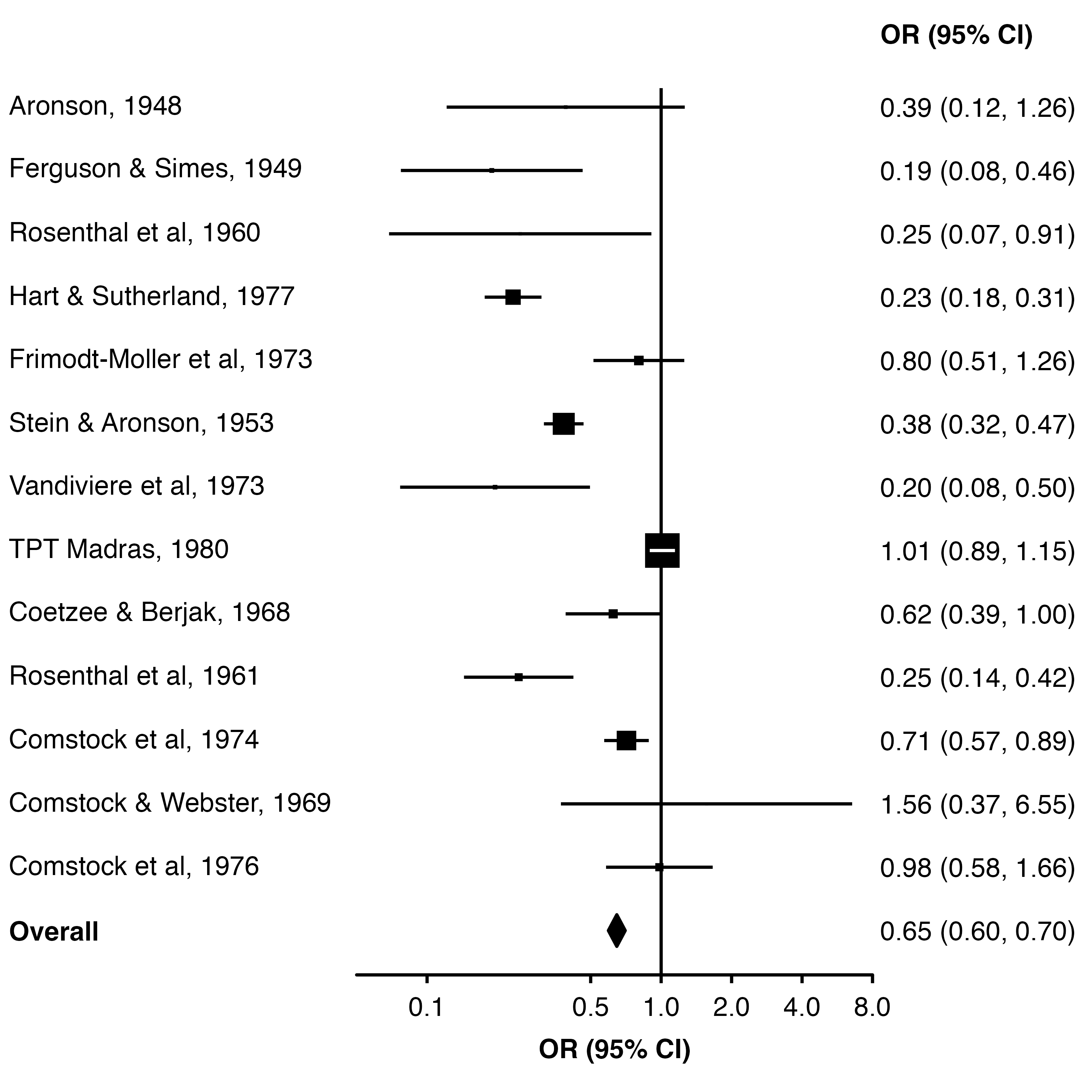
We could also create a column of TRUE/FALSE values and use col.diamond to identify which estimates should be shown as diamonds.
dat$plot_diamond <- dat$study == "Overall"

forest_plot(dat,
            col.estimate = "yi",
            col.stderr   = "se",
            col.key      = "study",
            xlim         = c(0.05, 8),
            xticks       = c(0.1, 0.5, 1, 2, 4, 8),
            xlab         = "OR (95% CI)",
            scalepoints  = TRUE,
            pointsize    = 8,
            panel.width  = unit(60, "mm"),
            col.diamond  = "plot_diamond",
            bold.labels  = "Overall")
16.5 Refining the layout
We can set fill = "white" to make the middle of the diamond white (the points for each study are a shape without a ‘fill’, so they are unaffected).
An easy way to add extra space above the row for ’Overall” is to add a row to the data frame with a blank study name.
forest_plot(dplyr::add_row(dat, study = "", .before = 14),
            col.estimate = "yi",
            col.stderr   = "se",
            col.key      = "study",
            xlim         = c(0.05, 8),
            xticks       = c(0.1, 0.5, 1, 2, 4, 8),
            xlab         = "OR (95% CI)",
            scalepoints  = TRUE,
            pointsize    = 8,
            panel.width  = unit(60, "mm"),
            fill         = "white",
            diamond      = "Overall",
            bold.labels  = "Overall")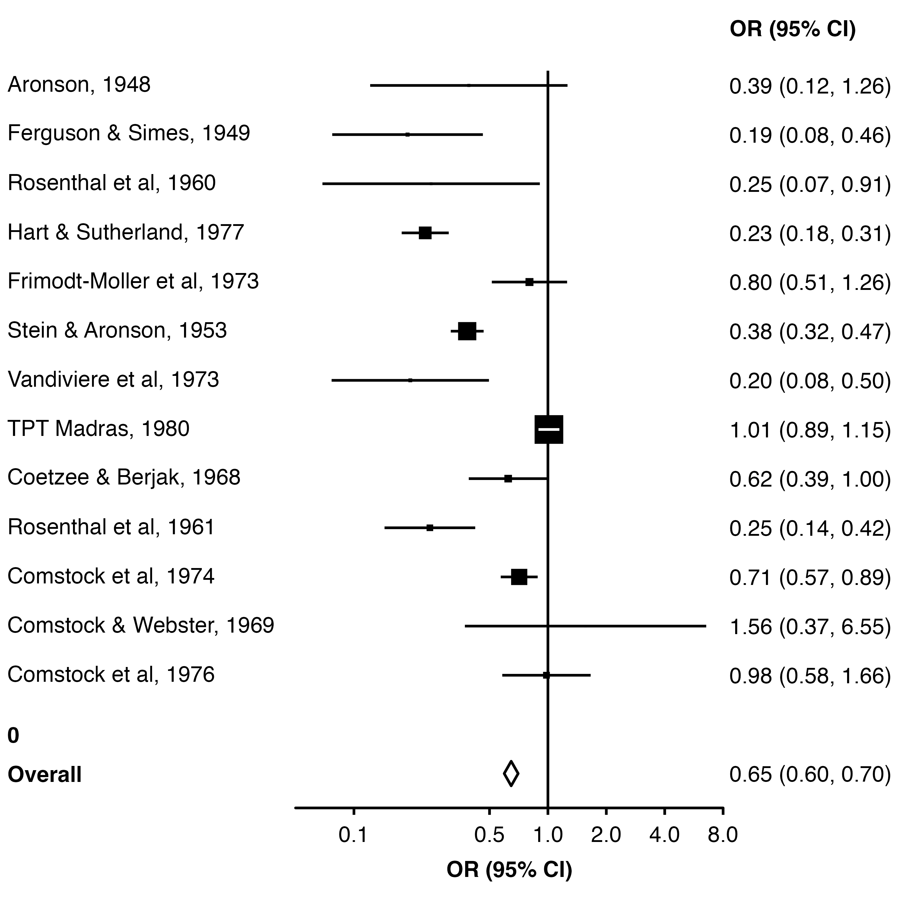
16.5.1 Using row.labels
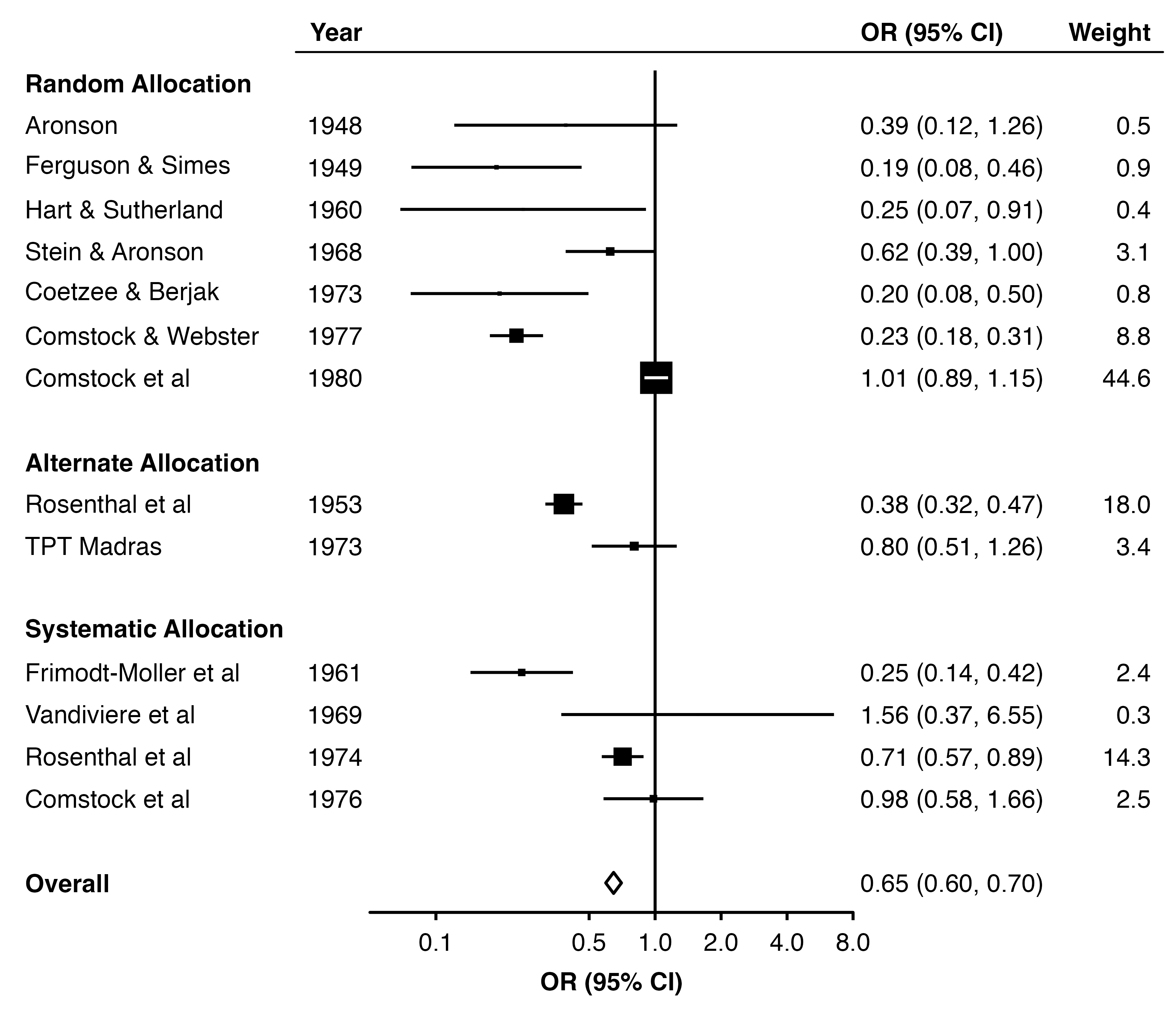
We can use row.labels to group the studies by treatment allocation.
First, we create a data frame which contains columns ‘study’ (key that links these labels to the results data frame), ‘label’ (label we want to show in the plot) and ‘alloc’ (row heading, the method of treatment allocation in each trial).
row_labels <- data.frame(
  study = paste(dat.bcg$author, dat.bcg$year, sep = ", "),
  alloc = paste(stringr::str_to_title(dat.bcg$alloc), "Allocation"),
  label = paste(dat.bcg$author, dat.bcg$year, sep = ", ")
) |>
  dplyr::arrange(dat.bcg$year) |>
  dplyr::add_row(label = "Overall",
                 study = "Overall",
                 alloc = NA)


row_labels
study alloc label
1 Aronson, 1948 Random Allocation Aronson, 1948
2 Ferguson & Simes, 1949 Random Allocation Ferguson & Simes, 1949
3 Stein & Aronson, 1953 Alternate Allocation Stein & Aronson, 1953
4 Rosenthal et al, 1960 Random Allocation Rosenthal et al, 1960
5 Rosenthal et al, 1961 Systematic Allocation Rosenthal et al, 1961
6 Coetzee & Berjak, 1968 Random Allocation Coetzee & Berjak, 1968
7 Comstock & Webster, 1969 Systematic Allocation Comstock & Webster, 1969
8 Frimodt-Moller et al, 1973 Alternate Allocation Frimodt-Moller et al, 1973
9 Vandiviere et al, 1973 Random Allocation Vandiviere et al, 1973
10 Comstock et al, 1974 Systematic Allocation Comstock et al, 1974
11 Comstock et al, 1976 Systematic Allocation Comstock et al, 1976
12 Hart & Sutherland, 1977 Random Allocation Hart & Sutherland, 1977
13 TPT Madras, 1980 Random Allocation TPT Madras, 1980
14 Overall <NA> OverallNow we set row.labels = row_labels. By default, the function will use the alloc column to group the rows and add subtitles, and use the label column to label each row. This is because they are used in the order they appear in the row labels data frame.
forest_plot(dat,
            row.labels   = row_labels,
            col.estimate = "yi",
            col.stderr   = "se",
            col.key      = "study",
            xlim         = c(0.05, 8),
            xticks       = c(0.1, 0.5, 1, 2, 4, 8),
            xlab         = "OR (95% CI)",
            scalepoints  = TRUE,
            pointsize    = 8,
            panel.width  = unit(60, "mm"),
            fill         = "white",
            diamond      = "Overall",
            bold.labels  = "Overall")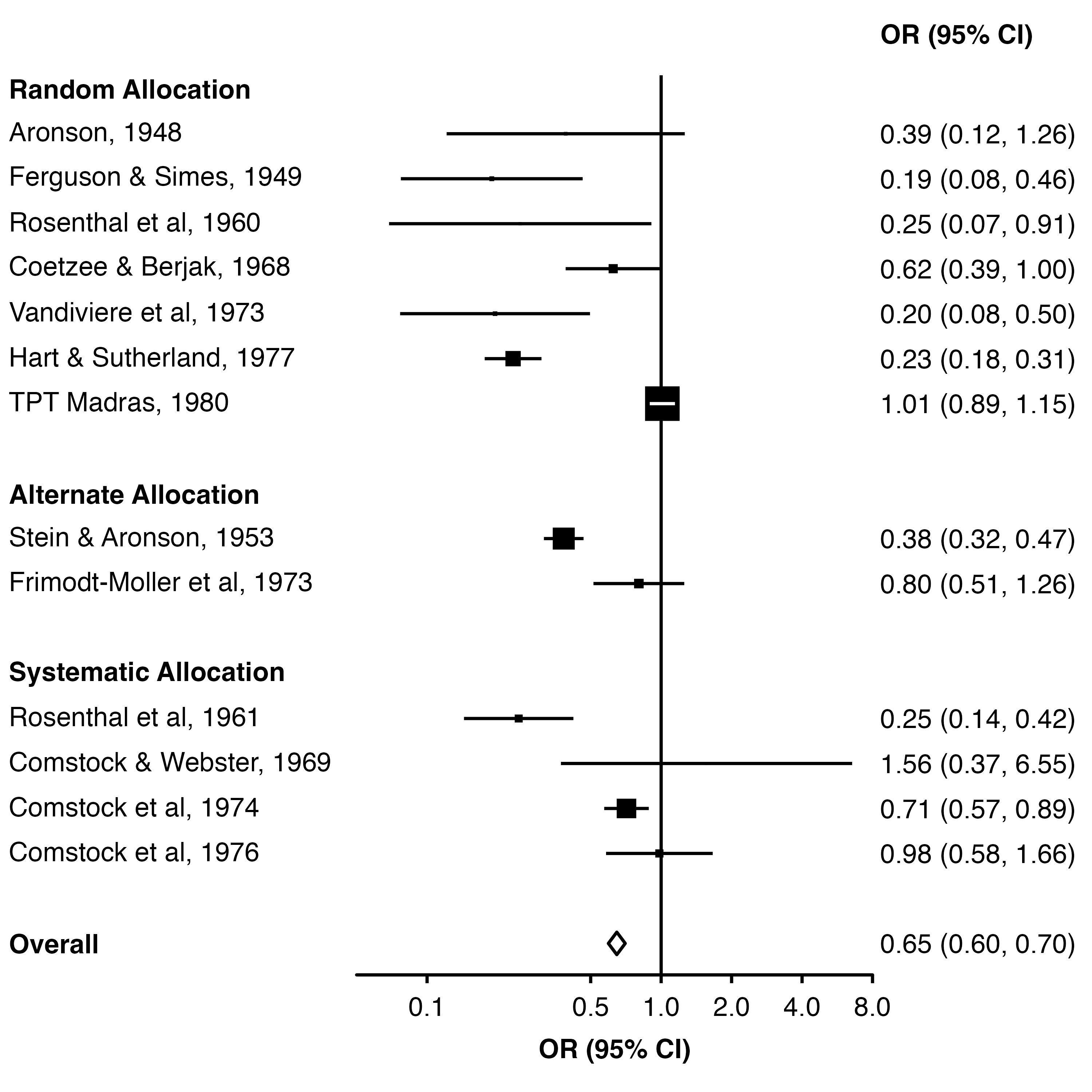
16.5.2 Adding text colums
We can use col.left and col.right to add columns of text to the plot.
dat$weight_text <- format(round(dat$weight, 1), nsmall = 1)
dat$weight_text[[14]] <- ""

row_labels$label <- c(dat$author[1:13], "Overall")

forest_plot(dat,
            row.labels        = row_labels,
            col.estimate      = "yi",
            col.stderr        = "se",
            col.key           = "study",
            xlim              = c(0.05, 8),
            xticks            = c(0.1, 0.5, 1, 2, 4, 8),
            xlab              = "OR (95% CI)",
            col.right         = "weight_text",
            right.heading = c("OR (95% CI)", "Weight"),
            right.hjust   = c(0, 1),
            col.left          = "year",
            left.heading  = "Year",
            heading.rule  = TRUE,
            scalepoints       = TRUE,
            pointsize         = 8,
            panel.width       = unit(60, "mm"),
            fill              = "white",
            diamond           = "Overall",
            bold.labels       = "Overall")