Some risk factors include a continuous and categorical element. For example, a continuous smoking-related exposure and a “never smoker” group. These can be plotted by setting a dummy risk factor value for the group(s), then adding a custom x-axis scale to add appropriate labels.
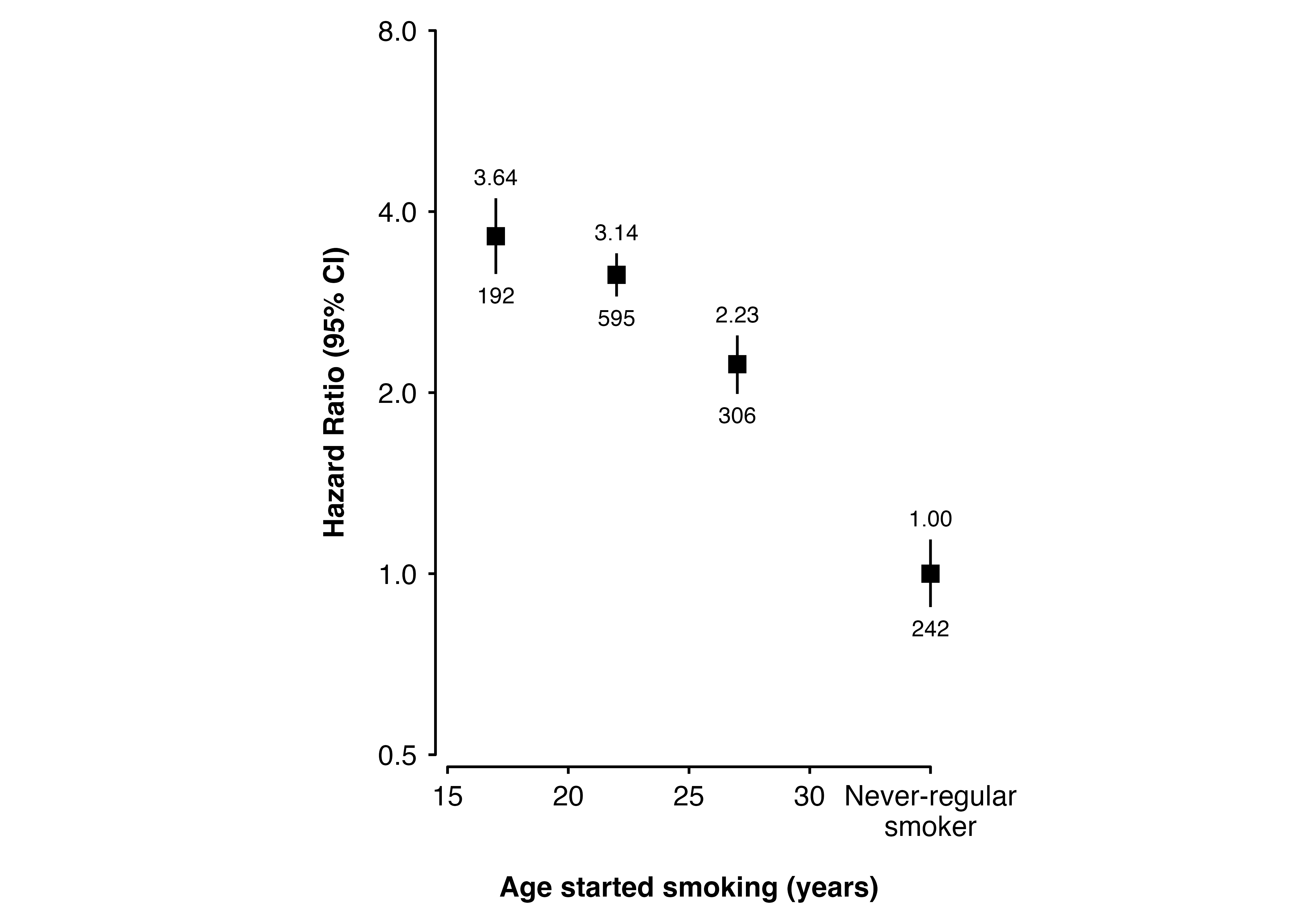
For example, placing a “never-regular smoker” group to the right of the plot:
<- data.frame (age_started_smoking = c ("Never-regular smoker" , "<18" , "18-24" , "25+" ),x = c (35 , 17 , 22 , 27 ),est = log (c (1 , 3.64 , 3.14 , 2.23 )),lci = log (c (0.88 , 3.15 , 2.89 , 1.99 )),uci = log (c (1.14 , 4.21 , 3.41 , 2.49 )), n = c (242 , 192 , 595 , 306 )shape_plot (my_results,col.x = "x" ,col.lci = "lci" ,col.uci = "uci" ,col.n = "n" ,exp = TRUE ,xlab = "Age started smoking (years)" ,ylab = "Hazard Ratio (95% CI)" ,xlims = c (15 , 35 ),ylims = c (0.5 , 8 ),ybreaks = c (0.5 , 1 , 2 , 4 , 8 ),add = list (scale.x = scale_x_continuous (breaks = c (15 , 20 , 25 , 30 , 35 ),labels = c ("15" ,"20" ,"25" ,"30" ,"Never-regular \n smoker" ))
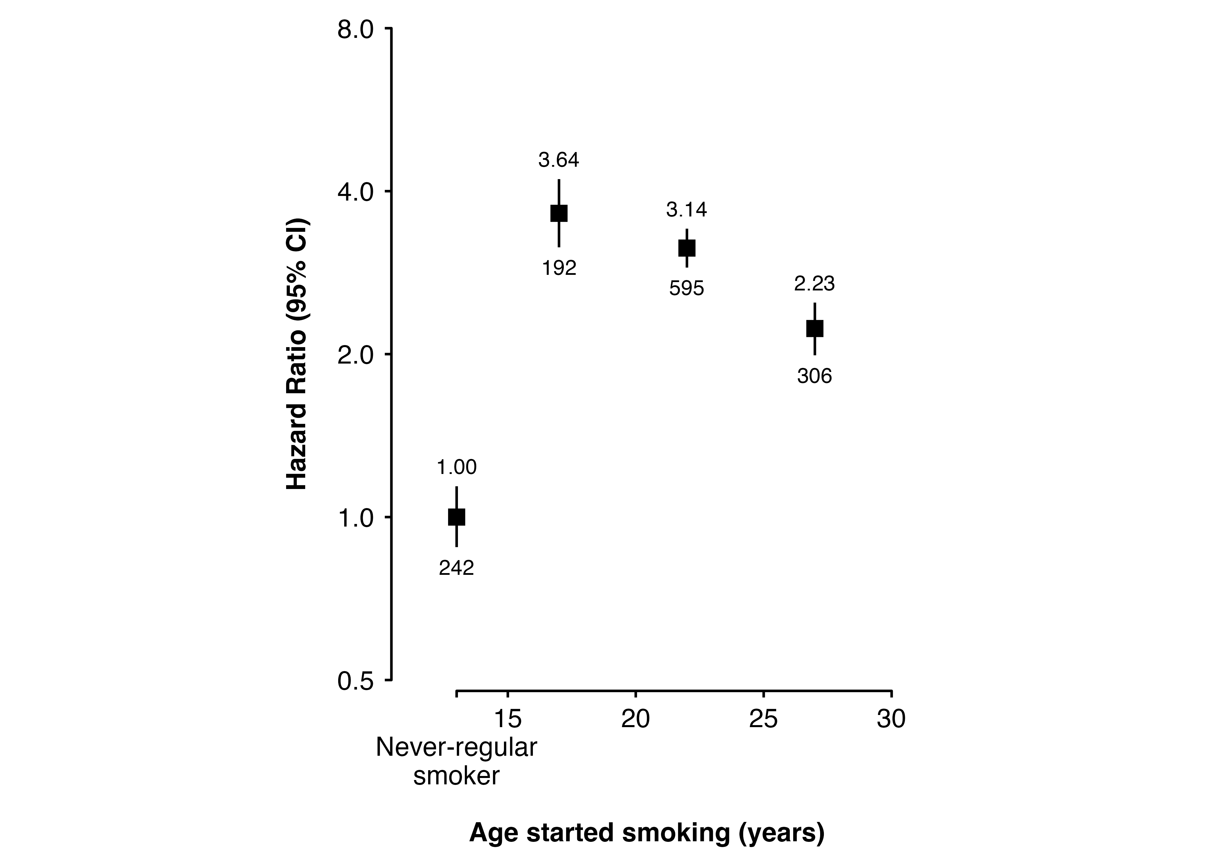
Or to the left of the plot (adding an empty line to avoid overlapping labels):
$ x <- c (13 , 17 , 22 , 27 )shape_plot (my_results,col.x = "x" ,col.lci = "lci" ,col.uci = "uci" ,col.n = "n" ,exp = TRUE ,xlab = "Age started smoking (years)" ,ylab = "Hazard Ratio (95% CI)" ,xlims = c (13 , 30 ),ylims = c (0.5 , 8 ),ybreaks = c (0.5 , 1 , 2 , 4 , 8 ),gap = c (0.15 , 0.025 ),add = list (scale.x = scale_x_continuous (breaks = c (13 , 15 , 20 , 25 , 30 ),labels = c (" \n Never-regular \n smoker" ,"15" ,"20" ,"25" ,"30" ))
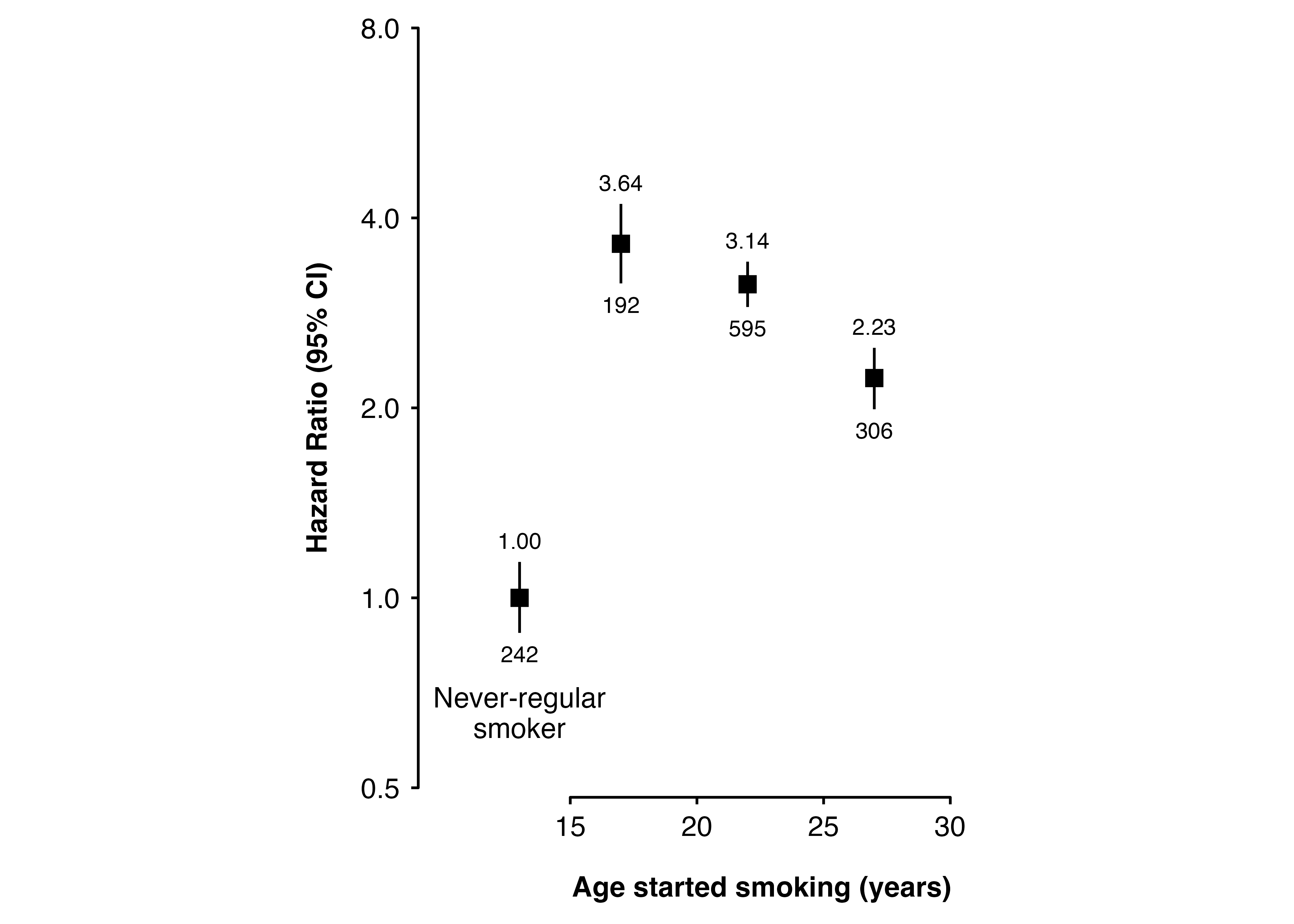
annotate() can also be used to add a group label to the plot:
shape_plot (my_results,col.x = "x" ,col.lci = "lci" ,col.uci = "uci" ,col.n = "n" ,exp = TRUE ,xlab = "Age started smoking (years)" ,ylab = "Hazard Ratio (95% CI)" ,xlims = c (15 , 30 ),ylims = c (0.5 , 8 ),ybreaks = c (0.5 , 1 , 2 , 4 , 8 ),xbreaks = c (15 , 20 , 25 , 30 ),gap = c (0.4 , 0.025 ),ratio = 2 ,add = list (end = list (annotate ("text" ,x = 13 ,y = 0.6 ,vjust = 0 ,lineheight = 0.9 ,label = "Never-regular \n smoker" ),# also add theme to adjust alignment of axis title theme (axis.title.x = element_text (hjust = 0.95 )))
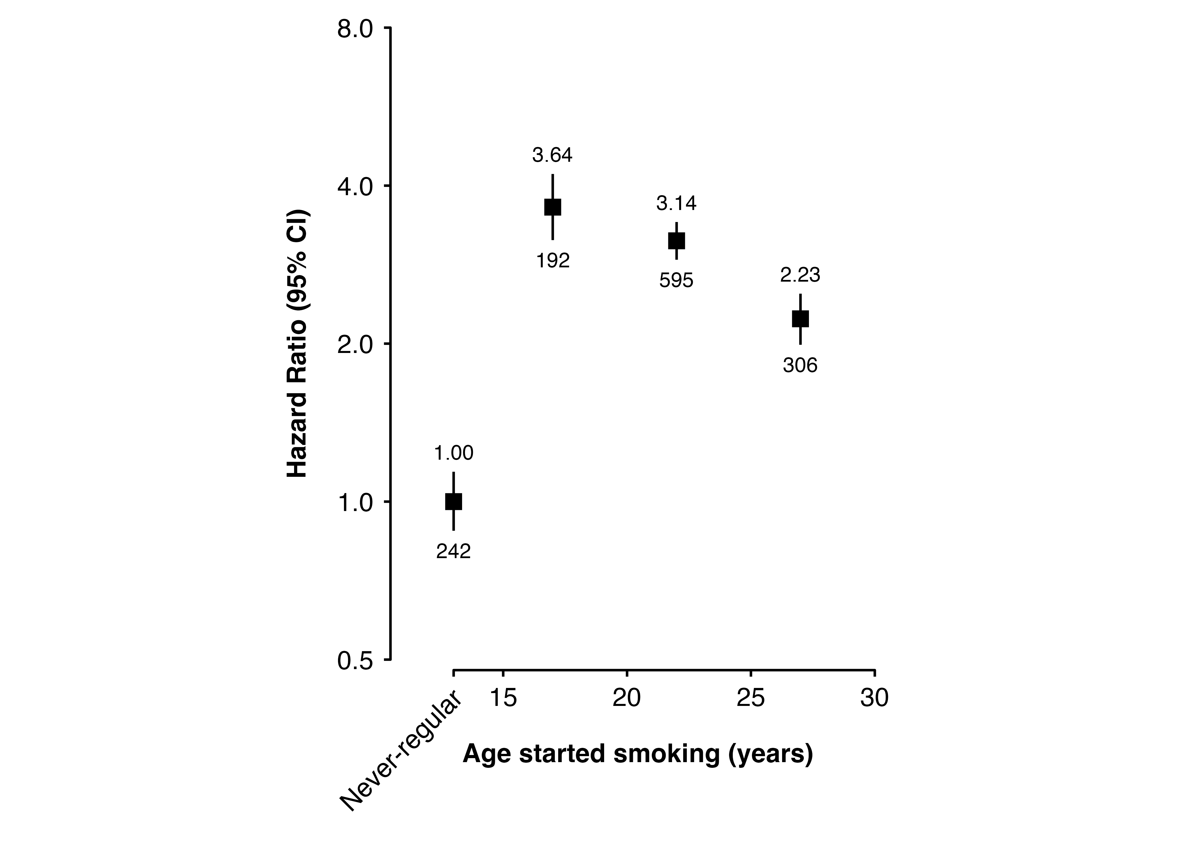
This could also be positioned below the x-axis, for example to include one rotated label:
shape_plot (my_results,col.x = "x" ,col.lci = "lci" ,col.uci = "uci" ,col.n = "n" ,exp = TRUE ,xlab = "Age started smoking (years)" ,ylab = "Hazard Ratio (95% CI)" ,xlims = c (13 , 30 ),ylims = c (0.5 , 8 ),ybreaks = c (0.5 , 1 , 2 , 4 , 8 ),gap = c (0.15 , 0.025 ),plot.margin = margin (0.5 , 1.5 , 2.5 , 0.5 , "lines" ),add = list (scale.x = scale_x_continuous (breaks = c (13 , 15 , 20 , 25 , 30 ),labels = c ("" ,"15" ,"20" ,"25" ,"30" )),end = annotate ("text" ,x = 13 ,y = 0.5 ,vjust = 1.9 ,hjust = 1.13 ,angle = 45 ,size = 3.87 ,label = "Never-regular" )