my_results <- data.frame(
  risk_factor = c(  17,    20,  23.5,    25,    29),
  est         = c(   0, 0.069, 0.095, 0.182, 0.214),
  se          = c(0.05, 0.048, 0.045, 0.045, 0.081)
)

p1 <- shape_plot(my_results,
                 col.x        = "risk_factor",
                 xlims        = c(15, 30),
                 ylims        = c(0.8, 2),
                 exponentiate = TRUE,
                 quiet        = TRUE)

p2 <- p13 Align similar plots
3.1 The challenge
We have two plots made using ckbplotr::shape_plot() which we want to place side-by-side. Here we are using two copies of the same plot for an example.
We could use the grid and gridExtra packages to arrange the plots side by side. (After using arrangeGrob we need to use grid.draw to print to plot.)
library(grid)
library(gridExtra)
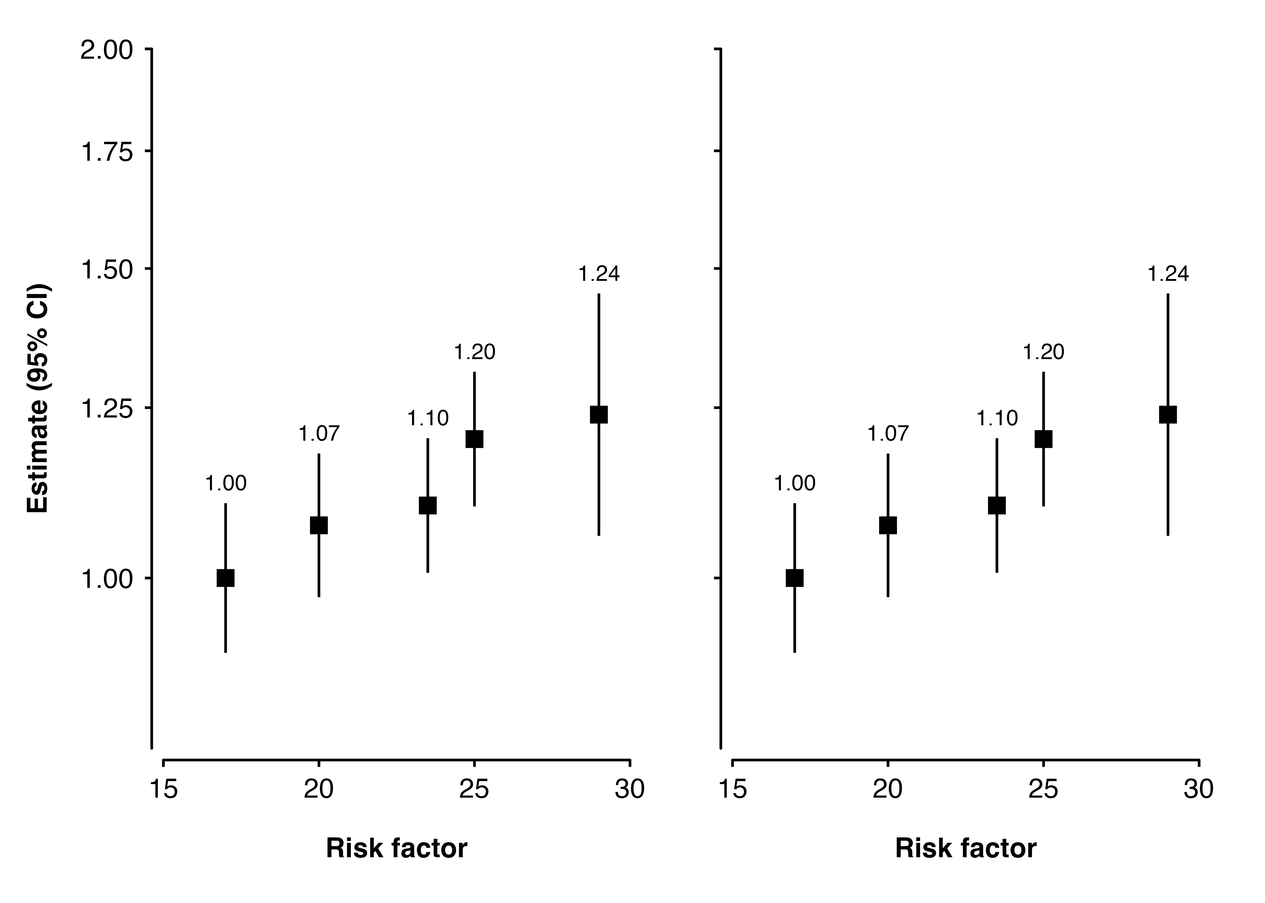
grid.draw(arrangeGrob(p1$plot, p2$plot, nrow = 1))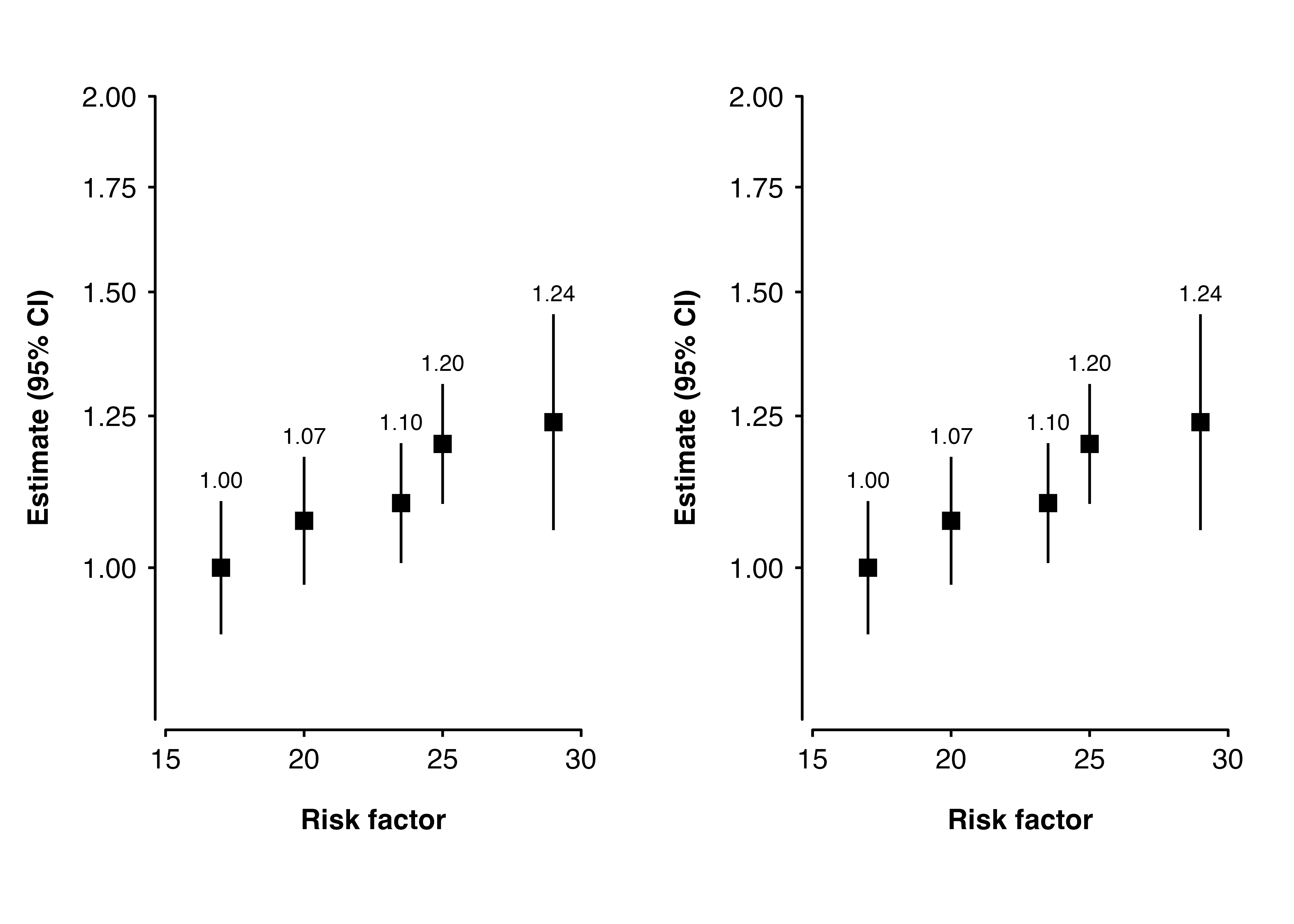
We could also try arranging the plots using the patchwork package.
library(patchwork)
p1$plot + p2$plot
Let’s say we don’t want to repeat the y-axis title and text on the second plot. We can use add to remove them using theme().
blank_y_axis <- theme(axis.text.y  = element_blank(),
                      axis.title.y = element_blank())

p2 <- shape_plot(my_results,
                 col.x        = "risk_factor",
                 xlims        = c(15, 30),
                 ylims        = c(0.8, 2),
                 exponentiate = TRUE,
                 quiet        = TRUE,
                 add          = list(end = blank_y_axis))

grid.draw(arrangeGrob(p1$plot, p2$plot, nrow = 1))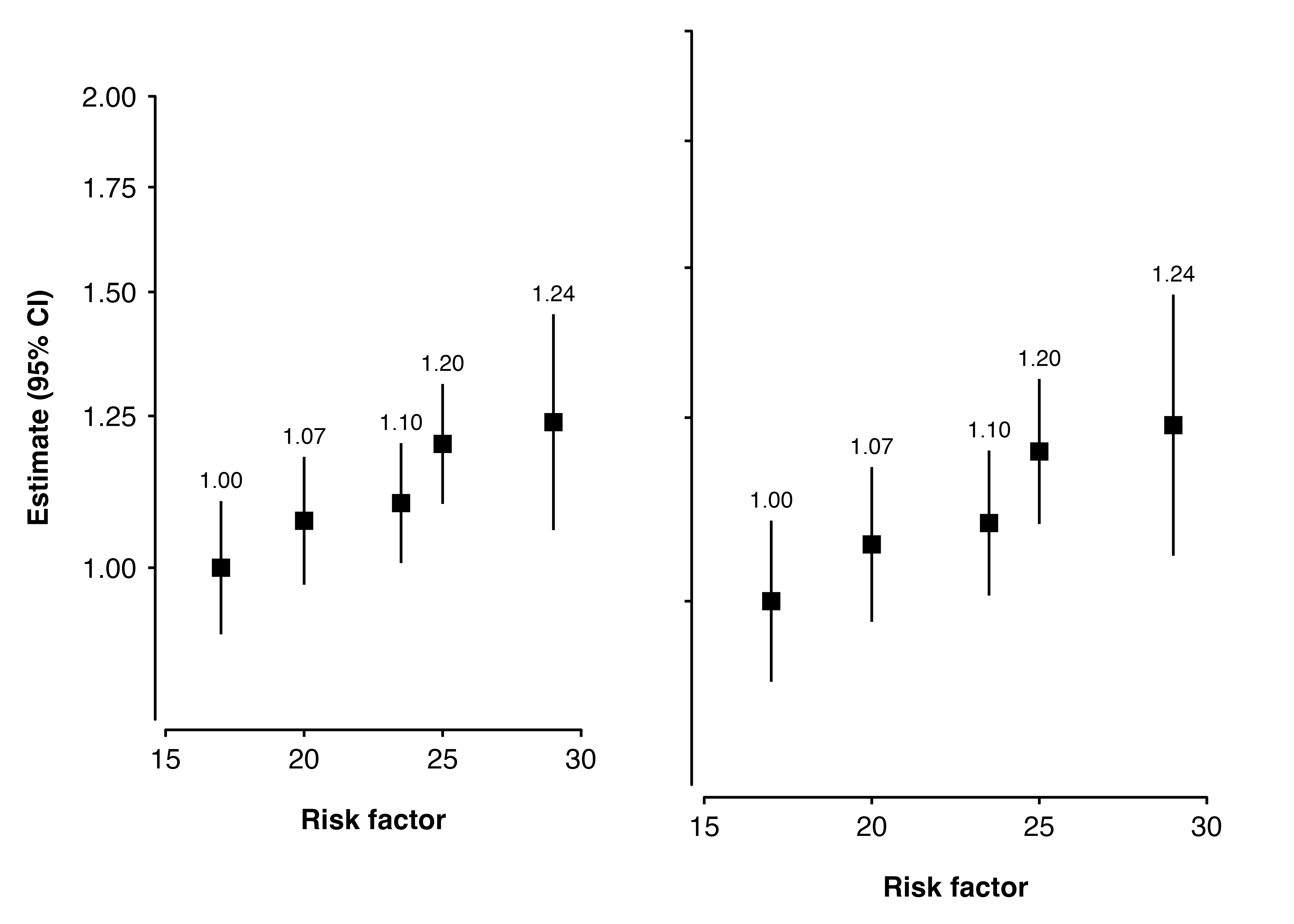
Oh no! The second plot is now larger - it fills the space left by removing the y-axis title and text. Read on for some suggestions for how we could fix this.
3.2 Solution 1: Set plot height
We can make sure the plots are the same size by explictly setting the height of each plot.
p1 <- shape_plot(my_results,
                 col.x        = "risk_factor",
                 xlims        = c(15, 30),
                 ylims        = c(0.8, 2),
                 exponentiate = TRUE,
                 quiet        = TRUE,
                 height       = unit(8, "cm"))

p2 <- shape_plot(my_results,
                 col.x        = "risk_factor",
                 xlims        = c(15, 30),
                 ylims        = c(0.8, 2),
                 exponentiate = TRUE,
                 quiet        = TRUE,
                 add          = list(end = blank_y_axis),
                 height       = unit(8, "cm"))

grid.draw(arrangeGrob(p1$plot, p2$plot, nrow = 1))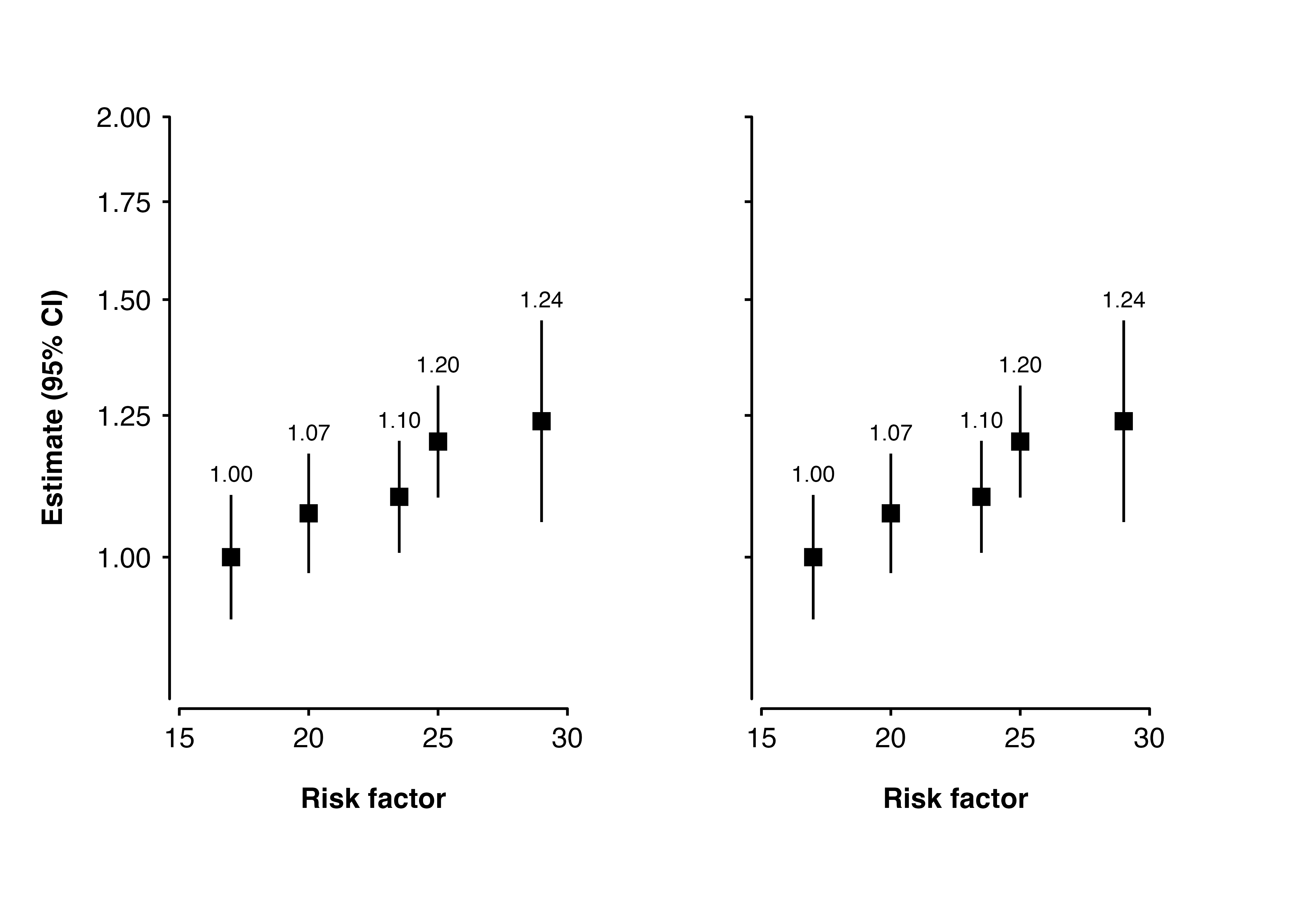
3.3 Solution 2: Use patchwork
Using the patchwork package to arrange the plots seems to work well.
p1 <- shape_plot(my_results,
                 col.x        = "risk_factor",
                 xlims        = c(15, 30),
                 ylims        = c(0.8, 2),
                 exponentiate = TRUE,
                 quiet        = TRUE)

p2 <- shape_plot(my_results,
                 col.x        = "risk_factor",
                 xlims        = c(15, 30),
                 ylims        = c(0.8, 2),
                 exponentiate = TRUE,
                 quiet        = TRUE,
                 add          = list(end = blank_y_axis))

library(patchwork)
p1$plot + p2$plot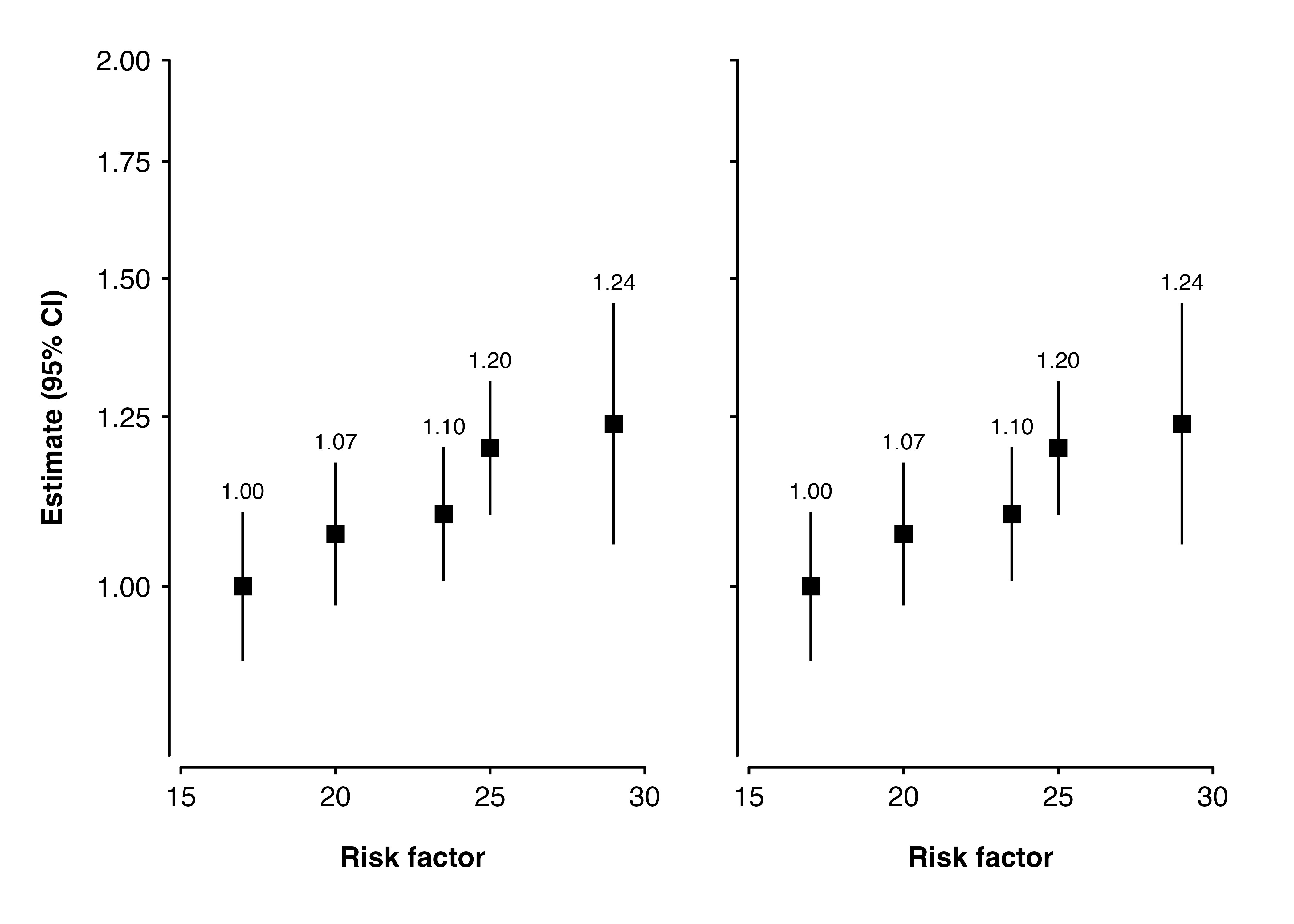
3.4 Solution 3: Transparent text
Instead of removing the y-axis text by setting them to element_blank(), we can make the colour transparent. Since the space is still left for the text, the otherwise similar plots become the same size.
transparent_y_axis <- theme(axis.text.y = element_text(colour = "transparent"),
                            axis.title.y = element_text(colour = "transparent"))

p1 <- shape_plot(my_results,
                 col.x        = "risk_factor",
                 xlims        = c(15, 30),
                 ylims        = c(0.8, 2),
                 exponentiate = TRUE,
                 quiet        = TRUE)

p2 <- shape_plot(my_results,
                 col.x        = "risk_factor",
                 xlims        = c(15, 30),
                 ylims        = c(0.8, 2),
                 exponentiate = TRUE,
                 quiet        = TRUE,
                 add          = list(end = transparent_y_axis))

grid.draw(arrangeGrob(p1$plot, p2$plot, nrow = 1))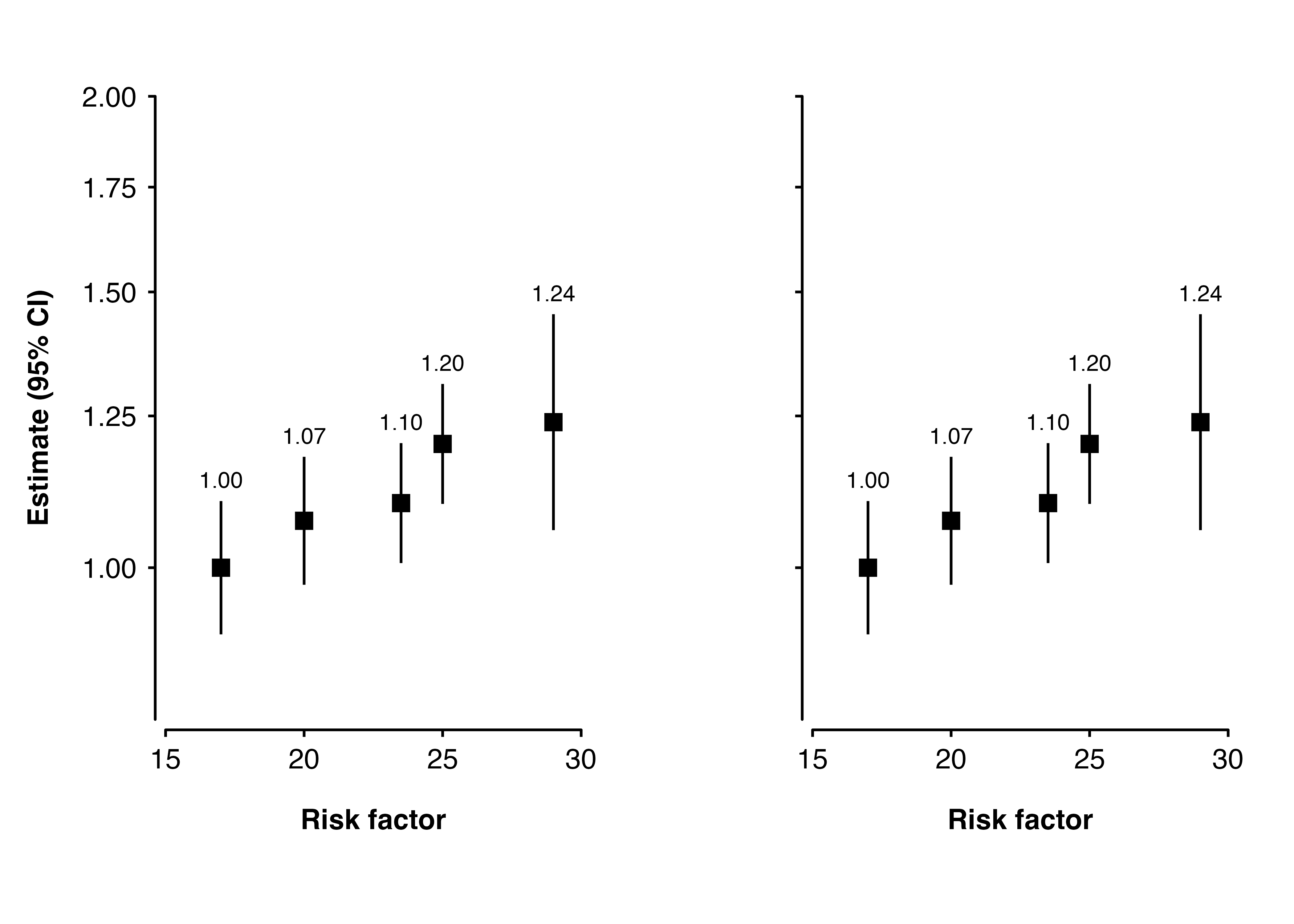
3.5 Solution 4: Build and cbind
We could first generate ggplot2 plot grobs, then use gridExtra::gtable_cbind to attach them side-by-side.
p1 <- shape_plot(my_results,
                 col.x        = "risk_factor",
                 xlims        = c(15, 30),
                 ylims        = c(0.8, 2),
                 exponentiate = TRUE,
                 quiet        = TRUE)

p2 <- shape_plot(my_results,
                 col.x        = "risk_factor",
                 xlims        = c(15, 30),
                 ylims        = c(0.8, 2),
                 exponentiate = TRUE,
                 quiet        = TRUE,
                 add          = list(end = blank_y_axis))

figure <- gridExtra::gtable_cbind(ggplotGrob(p1$plot),
                                  ggplotGrob(p2$plot))
grid::grid.draw(figure)