Log scale
Set the logscale argument to true to use a log scale on
the vertical axis. If your estimates and standard errors are on the log
scale (e.g. log hazard ratios), then set exponentiate to
true. This will plot exp(estimates) and use a log scale for the axis (if
logscale is not set).
shape_plot(ckbplotr_shape_data[ckbplotr_shape_data$is_female == 0,],
           col.x        = "rf",
           col.estimate = "est",
           col.stderr   = "se",
           col.n        = "n",
           xlims        = c(15, 50),
           ylims        = c(0.7, 3),
           ybreaks      = c(0.7, 1, 1.5, 2, 3),
           scalepoints  = TRUE,
           title        = NULL,
           logscale     = TRUE)
#> ℹ Narrow confidence interval lines may become hidden in the shape plot.
#> ℹ Please check your final output carefully and see
#>   vignette("shape_confidence_intervals") for more details.
#> This message is displayed once per session.
Using groups
The col.group argument can be supplied to plot results
for different groups (using shades of grey for the fill colour). Use the
legend.position to set the legend position.
data_to_plot <- ckbplotr_shape_data %>%
  dplyr::mutate(is_female = factor(is_female,
                                   levels = c(0, 1),
                                   labels = c("Men", "Women")))

shape_plot(data_to_plot,
           col.x        = "rf",
           col.estimate = "est",
           col.stderr   = "se",
           col.n        = "n",
           col.group    = "is_female",
           xlims        = c(15,50),
           ylims        = c(0.5, 3),
           scalepoints  = TRUE,
           title        = NULL,
           ciunder      = TRUE,
           legend.position = "bottom")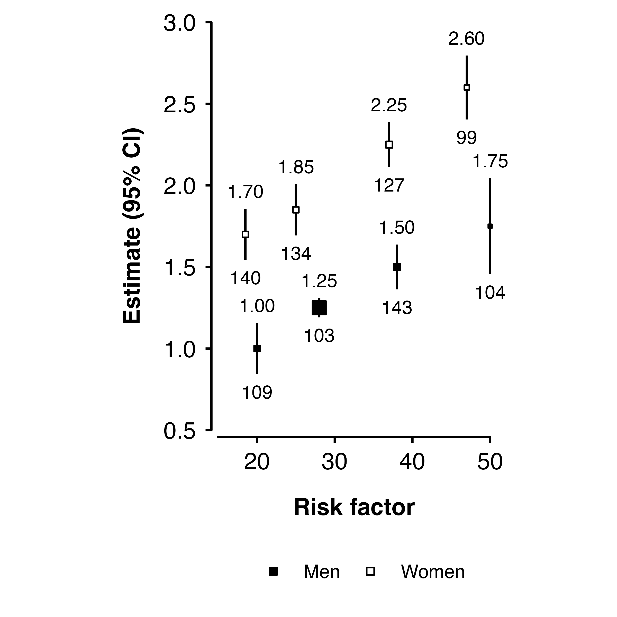
Labelling groups
To label points directly, you could add a geom_text() to
the plot:
shape_plot <- shape_plot(data_to_plot,
                         col.x        = "rf",
                         col.estimate = "est",
                         col.stderr   = "se",
                         col.n        = "n",
                         col.group    = "is_female",
                         xlims        = c(15,50),
                         ylims        = c(0.5, 3),
                         scalepoints  = TRUE,
                         title        = NULL,
                         ciunder      = TRUE,
                         legend.position = "none",
                         printplot    = FALSE)

shape_plot$plot +
  geom_text(aes(label = is_female),
            hjust = 0,
            nudge_x = 2.5,
            data = ~ dplyr::group_by(., is_female) %>% dplyr::filter(rf == max(rf)))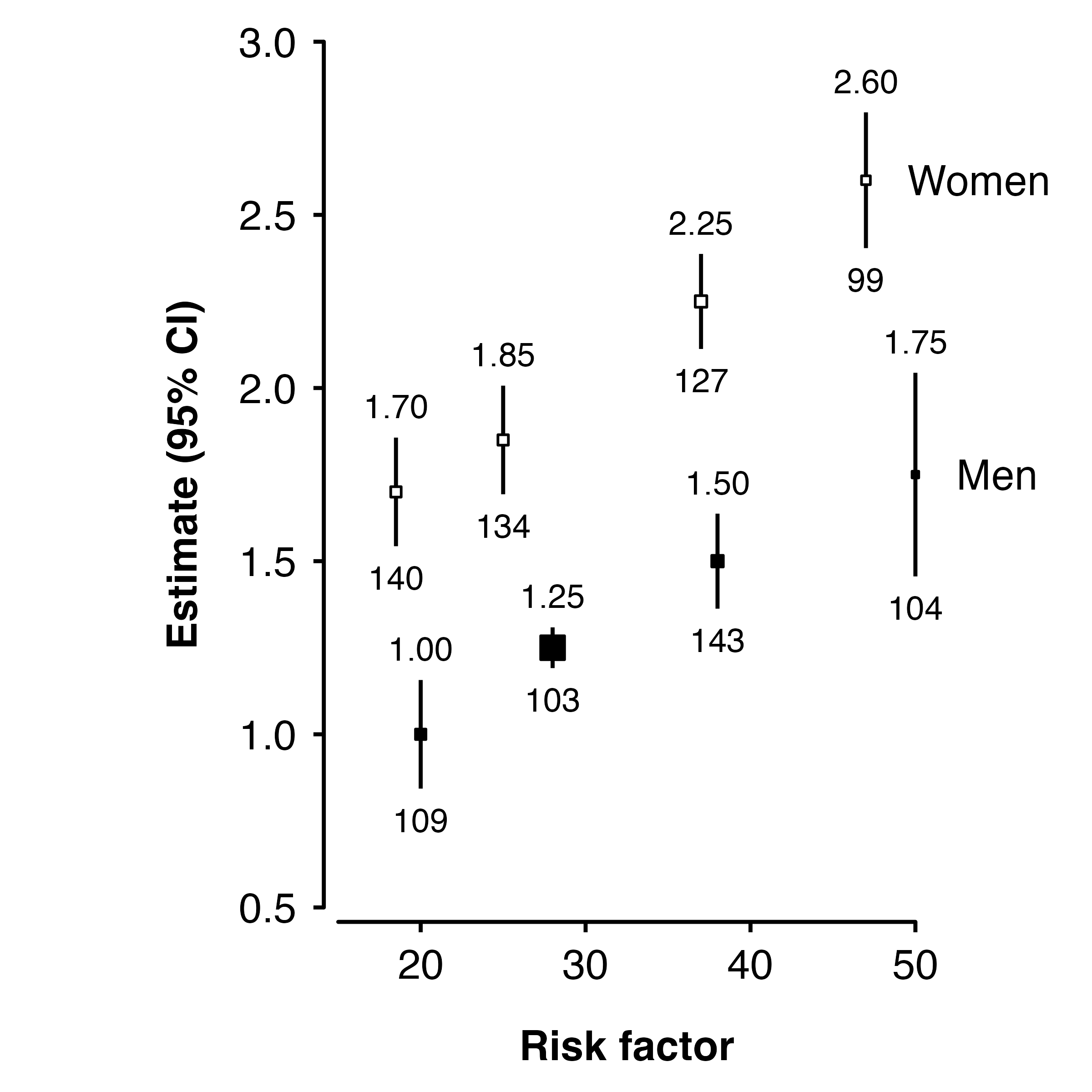
Removing estimates text
If you do not want to include the text above points in the plot, then
the addaes argument can be used to set label to
NA. This will cause a warning from ggplot2 about rows
containing missing values.
shape_plot(ckbplotr_shape_data[ckbplotr_shape_data$is_female == 0,],
           col.x        = "rf",
           col.estimate = "est",
           col.stderr   = "se",
           xlims        = c(15, 50),
           ylims        = c(0.7, 3),

           addaes       = list(estimates = "label = NA"))
#> Warning: Removed 4 rows containing missing values (`geom_text()`).
See “Changing generated code” for more on the addaes argument.
Adding lines
The lines argument will add lines (linear fit through
estimates on plotted scale, weighted by inverse variance) for each
group.
shape_plot(data_to_plot,
           col.x        = "rf",
           col.estimate = "est",
           col.stderr   = "se",
           col.n        = "n",
           col.group    = "is_female",
           xlims        = c(15,50),
           ylims        = c(0.5, 3),
           scalepoints  = TRUE,
           title        = NULL,
           ciunder      = TRUE,
           lines        = TRUE)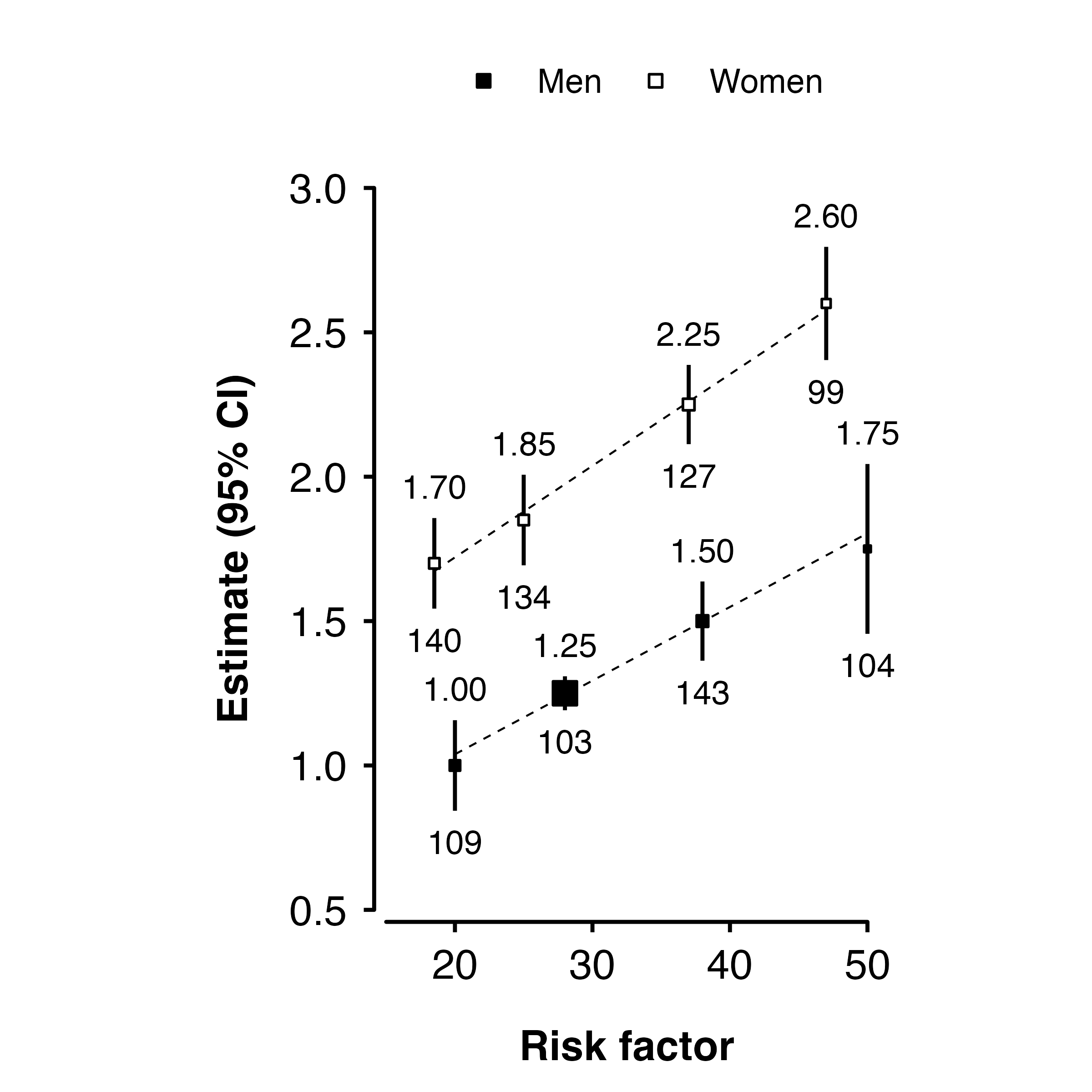
Setting aesthetics
The shape and fill colour of points, and colour of points and
confidence interval lines can be set overall or on a per-point basis.
This is done by setting arguments shape,
colour, cicolour, fill, and
ciunder to appropriate values, or to the name of a column
containing values for each point.
The argument/columns, what they control, and the type:
| argument | controls | type |
|---|---|---|
| shape | plotting character for points | integer |
| colour | colour of points | character |
| cicolour | colour of CI lines | character |
| fill | fill colour of points | character |
| ciunder | if the CI line should be plotted before the point | logical |
(Note that the approach for using columns to specify colours and shapes in this package does not make use of the automatic scales available in ggplot. We recommend you take a look at the ggplot2 documentation for better examples if you want to write ggplot2 code.)
Using values
If the argument doesn’t match the name of a column in the data, then the value will be used for all points.
shape_plot(ckbplotr_shape_data,
           col.x        = "rf",
           col.estimate = "est",
           col.stderr   = "se",
           col.n        = "n",
           xlims        = c(15,50),
           ylims        = c(0.5, 3),
           scalepoints  = TRUE,
           ciunder      = TRUE,
           shape        = 23,
           colour       = "black",
           fill         = "red",
           cicolour     = "blue")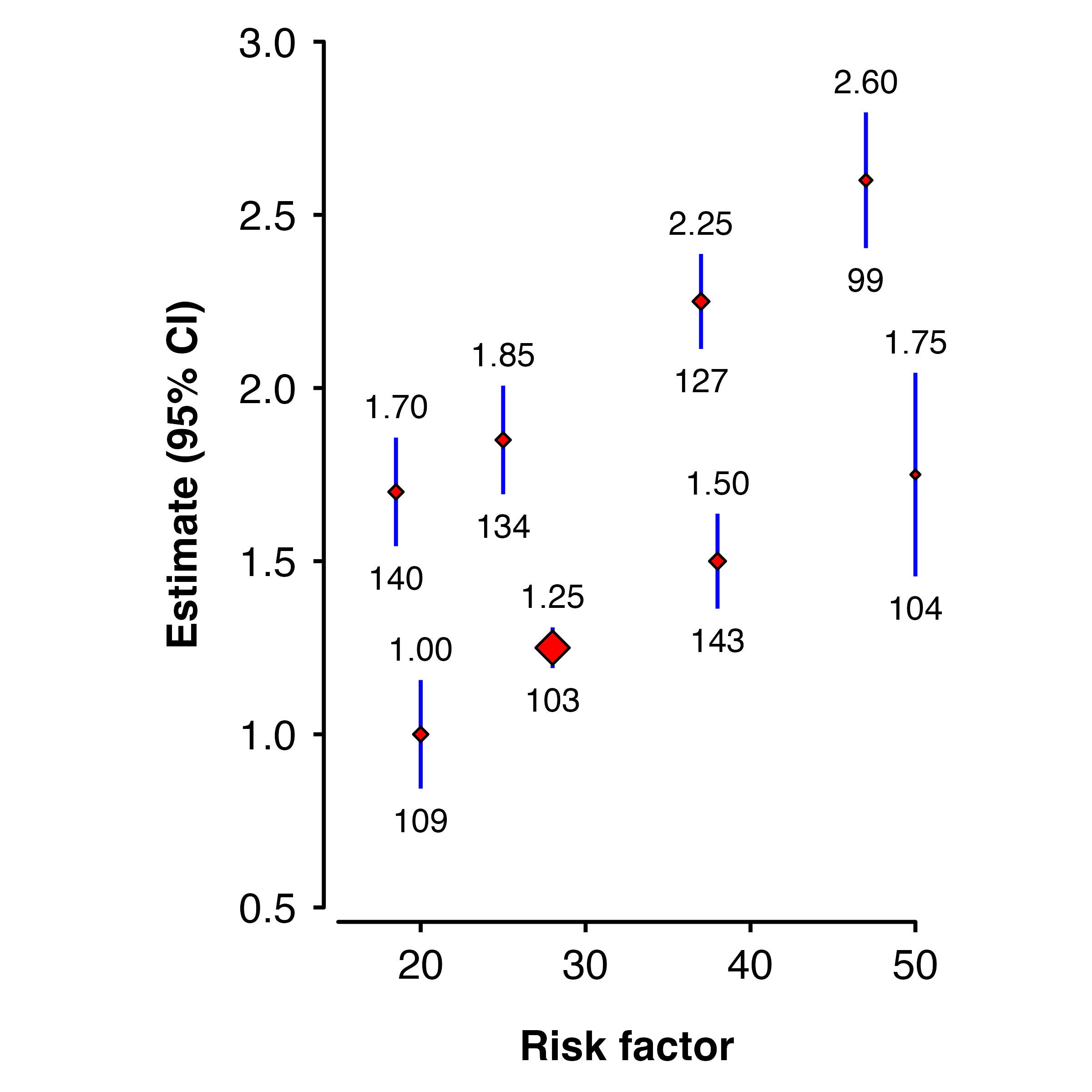
Using columns
If the argument matches a column name, then the values in the column will be used.
ckbplotr_shape_data$fillcol <- "black"
ckbplotr_shape_data[ckbplotr_shape_data$is_female == 1,]$fillcol <- "orange"

shape_plot(ckbplotr_shape_data,
           col.x        = "rf",
           col.estimate = "est",
           col.stderr   = "se",
           col.n        = "n",
           xlims        = c(15,50),
           ylims        = c(0.5, 3),
           scalepoints  = TRUE,
           ciunder      = TRUE,
           colour       = "fillcol",
           fill         = "fillcol")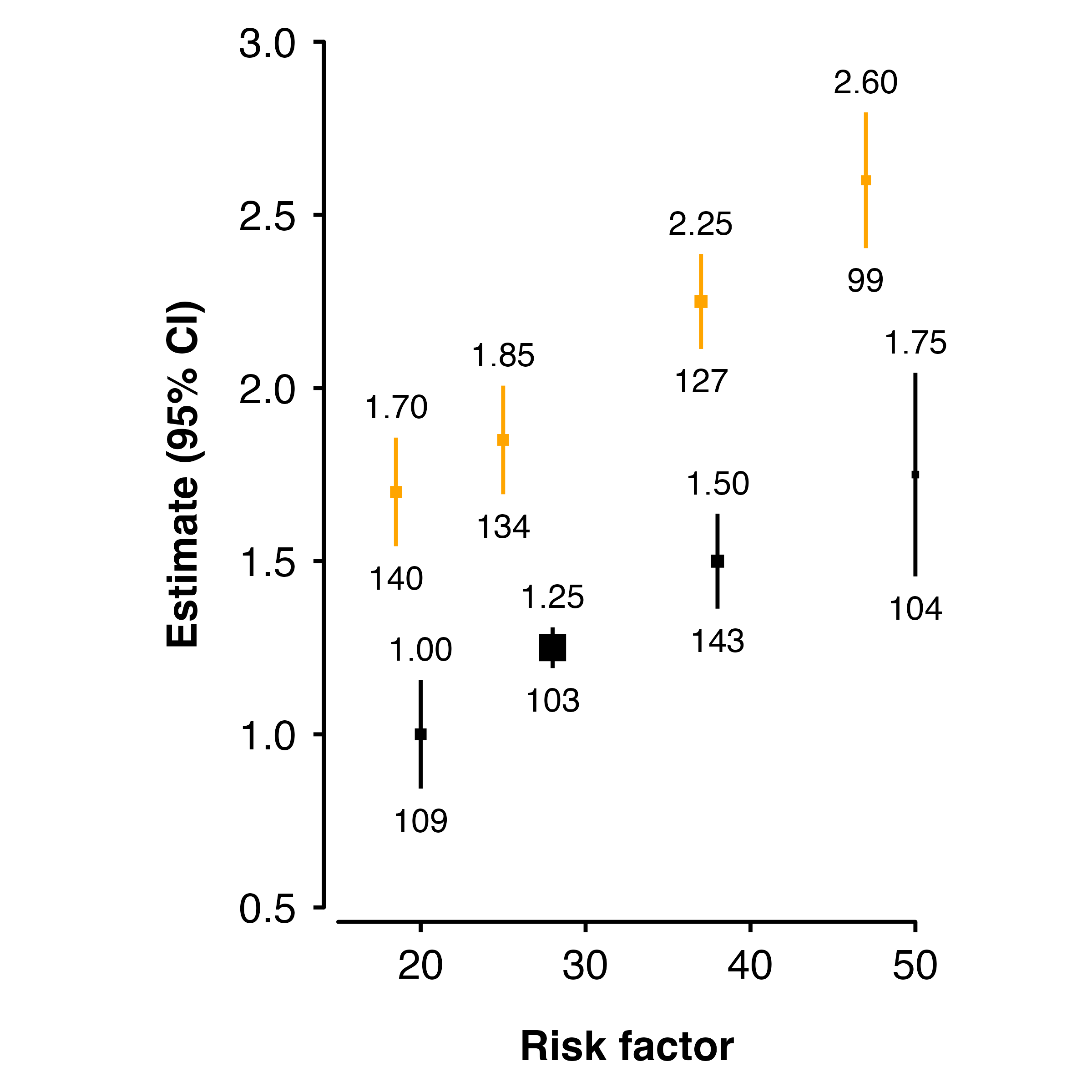
Categorical risk factor
The risk factor can be a factor. In this case, the x-axis coordinates are 1, 2, 3, .. so suitable x-axis limits are 0.5 and number of categories plus 0.5. You may need to add position arguments so that points, intervals and text do not overlap:
ckbplotr_shape_data$rf <- c(  "A",   "B",   "C",   "D", "A",   "B",   "C",  "D")

shape_plot(ckbplotr_shape_data,
           col.x        = "rf",
           col.estimate = "est",
           col.stderr   = "se",
           col.n        = "n",
           xlims        = c(0.5, 4.5),
           ylims        = c(0.5, 3),
           scalepoints  = TRUE,
           ciunder      = TRUE,
           addarg = list(point     = "position = position_dodge(width = 0.5)",
                         ci        = "position = position_dodge(width = 0.5)",
                         n         = "position = position_dodge(width = 0.5)",
                         estimates = "position = position_dodge(width = 0.5)"))
Stroke
The stroke argument sets the stroke aesthetic for
plotted shapes. See https://ggplot2.tidyverse.org/articles/ggplot2-specs.html
for more details. The stroke size adds to total size of a shape, so
unless stroke = 0 the scaling of size by inverse variance
will be slightly inaccurate (but there are probably more important
things to worry about).