Adding columns of text
Use the col.left and col.right arguments to
add columns of text either side of each panel. Use
col.left.heading and col.right.heading to
customise the column headings.
resultsA <- dplyr::filter(ckbplotr_forest_data, name == "A")
resultsB <- dplyr::filter(ckbplotr_forest_data, name == "B")

forest_plot(panels            = list(resultsA, resultsB),
            col.key           = "variable",
            row.labels        = ckbplotr_row_labels,
            row.labels.levels = c("heading", "subheading", "label"),
            rows              = c("Triglycerides concentration",
                                  "Lipoprotein particle concentration"),
            exponentiate      = TRUE,
            panel.headings    = c("Analysis A", "Analysis B"),
            ci.delim          = " - ",
            xlim              = c(0.9, 1.1),
            xticks            = c(0.9, 1, 1.1),
            blankrows         = c(1, 1, 0, 1),
            scalepoints       = TRUE,
            pointsize         = 3,
            col.left          = c("n"),
            col.left.heading  = c("No. of\nevents"),
            col.heading.space = 1.5)
#> ℹ Narrow confidence interval lines may become hidden in the forest plot.
#> ℹ Please check your final output carefully and see
#>   vignette("forest_confidence_intervals") for more details.
#> This message is displayed once per session.
Multiple columns can be added by specifying vectors for
col.left, col.right,
col.left.heading and col.right.heading.
forest_plot(panels            = list(resultsA, resultsB),
            col.key           = "variable",
            row.labels        = ckbplotr_row_labels,
            row.labels.levels = c("heading", "subheading", "label"),
            rows              = c("Triglycerides concentration",
                                  "Lipoprotein particle concentration"),
            exponentiate      = TRUE,
            panel.headings    = c("Analysis A", "Analysis B"),
            ci.delim          = " - ",
            xlim              = c(0.9, 1.1),
            xticks            = c(0.9, 1, 1.1),
            blankrows         = c(1, 1, 0, 1),
            scalepoints       = TRUE,
            pointsize         = 3,
            col.left          = c("nb", "n"),
            col.left.heading  = c("Some other\nnumbers", "No. of\nevents"),
            col.right         = "n",
            col.right.heading = c("HR", "N"),
            col.heading.space = 1.5)
The col.left.hjust and col.right.hjust
arguments set the horizontal justification of the columns (0 = left, 0.5
= center , 1 = right).
Spacing
Plot colour
The colour used for the plot can be changed with the
plotcolour argument. This can be useful to create plots
that fit a colour scheme (or use a dark grey for less contrast when
viewing on a screen or projector). See the next section for details on
customising the colour(s) of point and confidence interval lines.
forest_plot(panels            = list(resultsA, resultsB),
            col.key           = "variable",
            row.labels        = ckbplotr_row_labels,
            row.labels.levels = c("heading", "subheading", "label"),
            rows              = c("Triglycerides concentration",
                                  "Lipoprotein particle concentration"),
            exponentiate      = TRUE,
            panel.headings    = c("Analysis A", "Analysis B"),
            ci.delim          = " - ",
            xlim              = c(0.9, 1.1),
            xticks            = c(0.9, 1, 1.1),
            blankrows         = c(1, 1, 0, 1),
            scalepoints       = TRUE,
            pointsize         = 3,
            plotcolour        = "navyblue")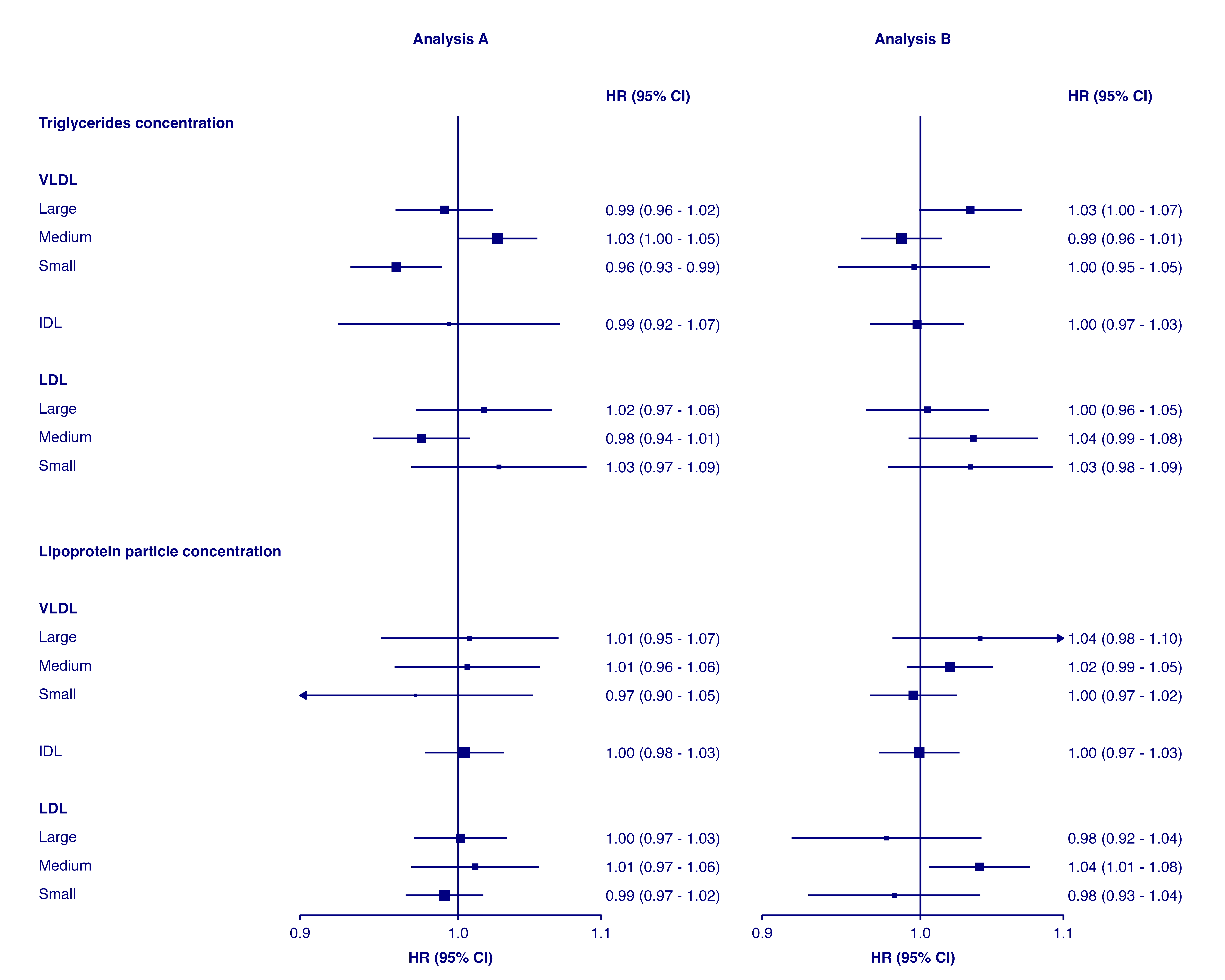
Setting colours and shapes, bold text and diamonds
The shape and fill colour of points, colour of points and confidence
interval lines, bold text, and which estimates/CIs should be plotted as
diamonds can be set overall or on a per-point basis. This is done by
setting arguments shape, colour,
fill, ciunder, col.bold, and
col.diamond to appropriate values, or to the name of a
column containing values for each point.
The argument/columns, what they control, and the type:
| argument | controls | type |
|---|---|---|
| shape | plotting character for points | integer |
| colour | colour of points and lines | character |
| fill | fill colour of points | character |
| ciunder | if the CI line should be plotted before the point | logical |
| col.bold | if text is bold | logical |
| col.diamond | if a diamond should be plotted | logical |
Note that col.bold, and col.diamond must be
column names in the supplied data frames, while the others can be fixed
values or column names.
Using values
forest_plot(panels           = list(resultsA),
            col.key          = "variable",
            row.labels       = ckbplotr_row_labels,
            row.labels.levels = c("heading", "subheading", "label"),
            rows             = c("Triglycerides concentration"),
            exponentiate     = TRUE,
            panel.names      = c("Analysis A"),
            blankrows        = c(0, 1, 0, 1),
            scalepoints      = TRUE,
            pointsize        = 3,
            shape            = 16,
            colour           = "red",
            cicolour         = "black",
            ciunder          = TRUE)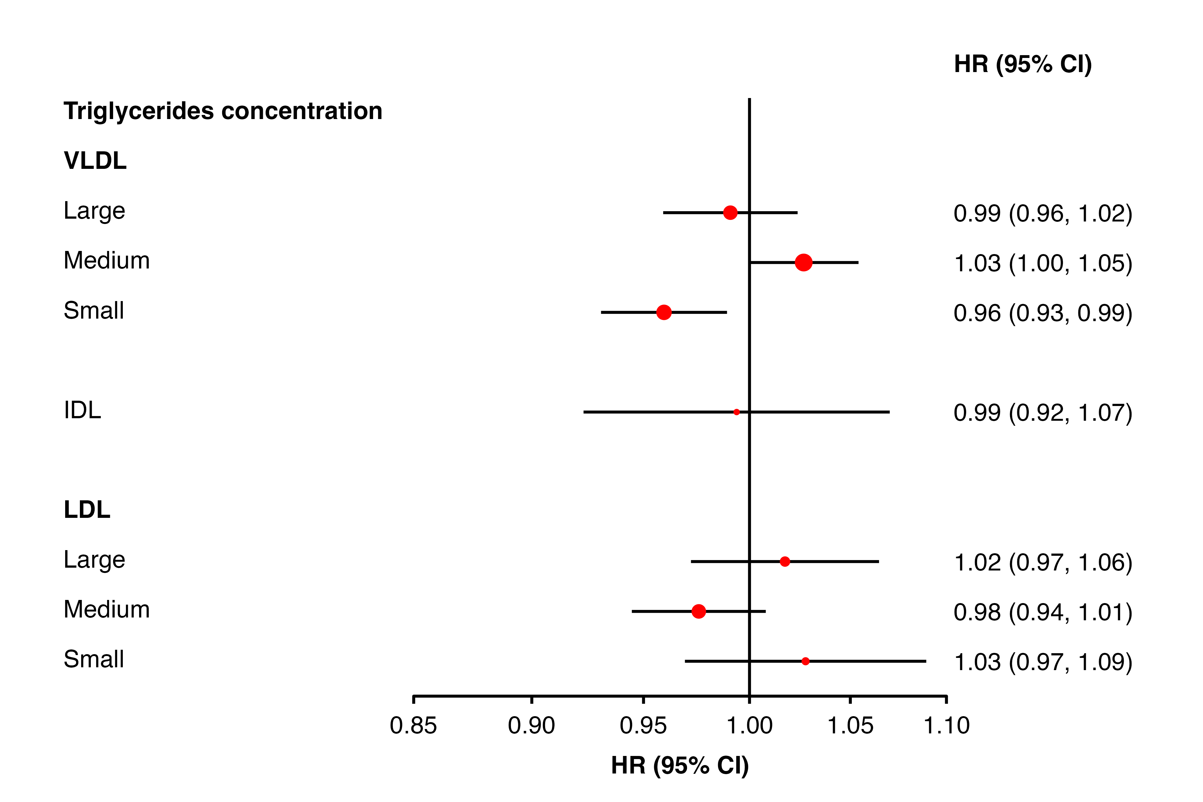
Using column names
resultsA[9,"shape"] <- 16
resultsA[10, "bold"] <- TRUE
resultsA[11, "colour"] <- "red"
resultsA[12, "diamond"] <- TRUE
resultsA[13, "ciunder"] <- TRUE
resultsA[13, "shape"] <- 22
resultsA[13, "fill"] <- "white"

forest_plot(panels           = list(resultsA),
            col.key          = "variable",
            row.labels       = ckbplotr_row_labels,
            row.labels.levels = c("heading", "subheading", "label"),
            rows             = c("Triglycerides concentration"),
            exponentiate     = TRUE,
            panel.names      = c("Analysis A"),
            blankrows        = c(0, 1, 0, 1),
            scalepoints      = TRUE,
            pointsize        = 3,
            shape            = "shape",
            colour           = "colour",
            fill             = "fill",
            col.bold         = "bold",
            col.diamond      = "diamond",
            ciunder          = "ciunder",
            stroke           = 0.1)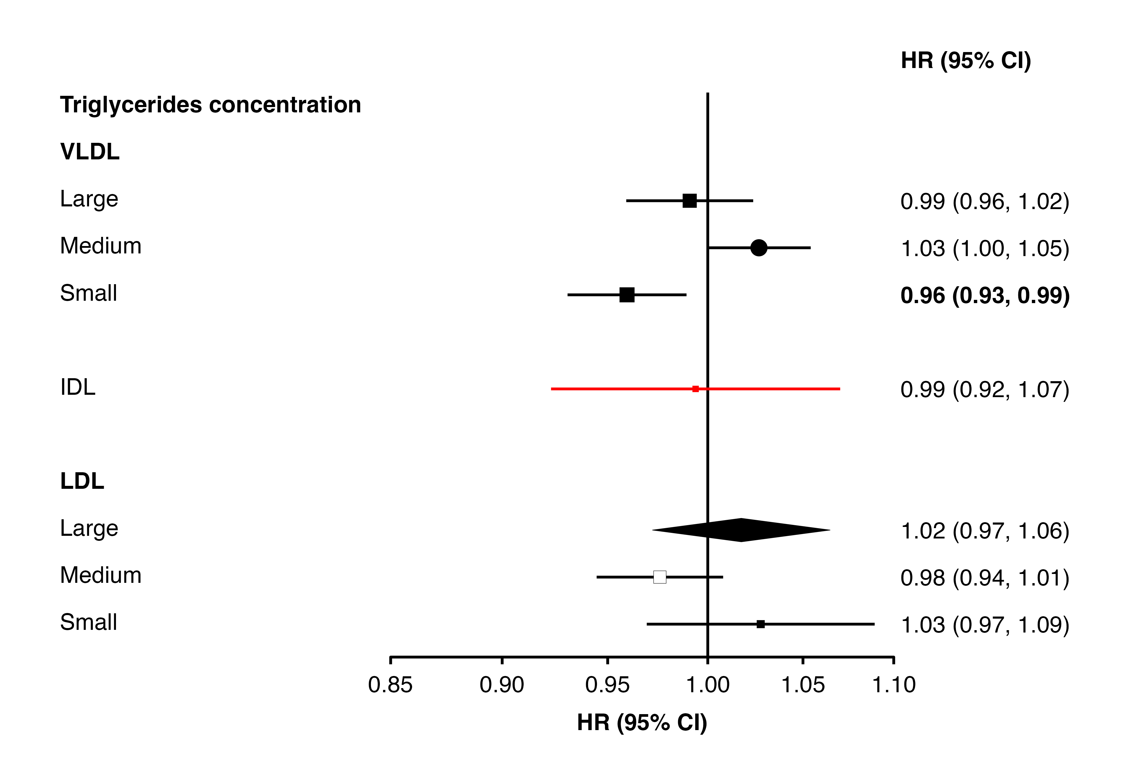
If a parameter is not set, then default values are used for these
aesthetics. If a parameter is set, then every data frame provided in
cols must contain a column with that name.
Diamond shortcut
As an alternative to using col.diamond, provide a
character vector in the diamond argument. In rows with
these key values, estimates and CIs will be plotted using a diamond. (If
a list is supplied, only the first element will be used.)
forest_plot(panels           = list(resultsA),
            col.key          = "variable",
            row.labels       = ckbplotr_row_labels,
            row.labels.levels = c("heading", "subheading", "label"),
            rows             = c("Triglycerides concentration"),
            exponentiate     = TRUE,
            panel.names      = c("Analysis A"),
            ci.delim         = " - ",
            blankrows        = c(0, 1, 0, 1),
            scalepoints      = TRUE,
            pointsize        = 3,
            col.left         = c("n"),
            col.left.heading = c("No. of\nevents"),
            diamond          = c("nmr_l_ldl_tg", "nmr_m_ldl_tg"))
Adding heterogeneity and trend test results and other text
The addtext argument can be used to add results of
heterogeneity or trend tests, or some other text, in the text column of
estimates and CIs.
The automatic positioning of columns and spacing of panels does not
take into account this additional text, so you may need to use the
right.space and col.right.pos arguments for a
satisfactory layout.
resultsA_extra
#>       variable het_dof het_stat het_p trend_stat trend_p
#> 1  nmr_s_ldl_p       2       12 =0.22       <NA>    <NA>
#> 2 nmr_s_vldl_p    <NA>     <NA>  <NA>          7   =0.31
resultsB_extra
#>       variable het_dof het_stat het_p trend_stat trend_p
#> 1  nmr_s_ldl_p       2       14 =0.32       <NA>    <NA>
#> 2 nmr_s_vldl_p    <NA>     <NA>  <NA>          7   =0.83
forest_plot(panels            = list(resultsA, resultsB),
            col.key           = "variable",
            row.labels        = ckbplotr_row_labels,
            row.labels.levels = c("heading", "subheading", "label"),
            rows              = c("Lipoprotein particle concentration",
                                  "Triglycerides concentration"),
            exponentiate      = TRUE,
            panel.headings    = c("Analysis A", "Analysis B"),
            ci.delim          = " - ",
            xlim              = c(0.9, 1.1),
            xticks            = c(0.9, 1, 1.1),
            blankrows         = c(1, 0, 0, 1),
            scalepoints       = TRUE,
            pointsize         = 3,
            col.left          = c("n"),
            col.left.heading  = c("No. of\nevents"),
            col.heading.space = 1.5,
            addtext           = list(resultsA_extra, resultsB_extra),
            right.space       = unit(35, "mm"))
To add multiple tests results and/or text under the same row, use
separate in the addtext data frames:
resultsA_extra
#>      variable het_dof het_stat het_p trend_stat trend_p
#> 1 nmr_s_ldl_p       2       12 =0.22       <NA>    <NA>
#> 2 nmr_s_ldl_p    <NA>     <NA>  <NA>          7   =0.31
forest_plot(panels            = list(resultsA),
            col.key           = "variable",
            row.labels        = ckbplotr_row_labels,
            row.labels.levels = c("heading", "subheading", "label"),
            rows              = c("Lipoprotein particle concentration"),
            exponentiate      = TRUE,
            panel.headings    = c("Analysis A"),
            ci.delim          = " - ",
            xlim              = c(0.9, 1.1),
            xticks            = c(0.9, 1, 1.1),
            blankrows         = c(1, 0, 0, 1),
            scalepoints       = TRUE,
            pointsize         = 3,
            col.left          = c("n"),
            col.left.heading  = c("No. of\nevents"),
            col.heading.space = 1.5,
            addtext           = list(resultsA_extra),
            right.space       = unit(35, "mm"))
Different limits and ticks on each plot
forest_plot() uses ggplot facets to place forest plots
side-by-side. Facets cannot easily have different scales (or limits or
ticks) applied, so it’s not directly possible to have different limits
and ticks on each forest plot.
However, one approach to work around this is to use
forest_plot() for each plot you need, setting the same
panel.width for all, remove the labels from all but the
first, then arrange them side-by-side. The gridExtra
package can be used for this last step.
Step 1: Use forest_plot() for each plot.
forestplot1 <- forest_plot(panels            = list(resultsA),
                           col.key           = "variable",
                           row.labels        = ckbplotr_row_labels,
                           row.labels.levels = c("heading", "subheading", "label"),
                           rows              = c("Lipoprotein particle concentration",
                                                 "Triglycerides concentration"),
                           exponentiate      = TRUE,
                           panel.names       = c("Analysis A"),
                           ci.delim          = " - ",
                           xlim              = c(0.9, 1.1),
                           xticks            = c(0.9, 1, 1.1),
                           blankrows         = c(1, 1, 0, 1),
                           scalepoints       = TRUE,
                           pointsize         = 3,
                           col.left          = c("n"),
                           col.left.heading  = c("No. of\nevents"),
                           col.heading.space = 1.5,
                           panel.width       = unit(20, "mm"),
                           printplot         = FALSE)

forestplot2 <- forest_plot(panels            = list(resultsB),
                           col.key           = "variable",
                           row.labels        = ckbplotr_row_labels,
                           row.labels.levels = c("heading", "subheading", "label"),
                           rows              = c("Lipoprotein particle concentration",
                                                 "Triglycerides concentration"),
                           exponentiate      = TRUE,
                           panel.names       = c("Analysis B"),
                           ci.delim          = " - ",
                           xlim              = c(0.8, 1.2),
                           xticks            = c(0.8, 1, 1.2),
                           blankrows         = c(1, 1, 0, 1),
                           scalepoints       = TRUE,
                           pointsize         = 3,
                           col.left          = c("n"),
                           col.left.heading  = c("No. of\nevents"),
                           col.heading.space = 1.5,
                           panel.width       = unit(20, "mm"),
                           printplot         = FALSE)
Step 2: Remove the axis text for all but the first plot.
p1 <- forestplot1$plot

p2 <- forestplot2$plot +
  theme(axis.text.y = element_blank())
Step 3: Arrange the plots using gridExtra (there may be
other packages that also work). (Adjust the widths argument
until you get a suitable layout.)
gridExtra::grid.arrange(p1, p2,
                        nrow = 1,
                        widths = c(1, 0.5))
Note that if scalepoints = TRUE (and minse
is not specified the same for each plot) then this scaling is on a
plot-by-plot basis so box sizes are not comparable between plots.
However, if different axis scales are used then confidence intervals are
not comparable either so this may be not be a problem.
Stroke
The stroke argument sets the stroke aesthetic for
plotted shapes. See https://ggplot2.tidyverse.org/articles/ggplot2-specs.html
for more details. The stroke size adds to total size of a shape, so
unless stroke = 0 the scaling of size by inverse variance
will be slightly inaccurate (but there are probably more important
things to worry about).