Confidence interval lines in shape plots
Source:vignettes/shape_confidence_intervals.Rmd
shape_confidence_intervals.RmdWhen making a shape plot, if a confidence interval line is smaller
than the point representing the estimate we may wish to plot the line
differently. In this package, this is possible by using the
height argument in the shape_plot()
function.
The sections below show how to change the colour of confidence lines and/or plot confidence lines before or after points. After using these methods, you should still carefully check the output (i.e. your final output file, not an RStudio preview) to ensure confidence interval lines are not hidden.
Changing the colour
To plot short confidence widths a different colour, set the
height argument of shape_plot() (this will
also fix the height of the plot).
Notes: This has been designed to work well for shape 15 (the default)
and 22. The calculation of sizes (and accounting for the stroke
aesthetic) may not be entirely accurate, so check the output and change
the height argument as needed. Confidence intervals are
assumed to be centred on the point estimate.
shape_plot(ckbplotr_shape_data[ckbplotr_shape_data$is_female == 0,],
           col.x        = "rf",
           col.estimate = "est",
           col.stderr   = "se",
           col.n        = "n",
           xlims        = c(15, 50),
           ylims        = c(0.7, 3),
           ybreaks      = c(0.7, 1, 1.5, 2, 3),
           scalepoints  = TRUE,
           pointsize    = 9,
           logscale     = TRUE,
           height       = unit(90, "mm"))
The cicolour argument can be a character vector - the
last element will be used for short confidence intervals.
You may want to adjust the position of the text plotted above and
below points, using addaes or addarg to change
vjust values:
shape_plot(ckbplotr_shape_data[ckbplotr_shape_data$is_female == 0,],
           col.x        = "rf",
           col.estimate = "est",
           col.stderr   = "se",
           col.n        = "n",
           xlims        = c(15, 50),
           ylims        = c(0.7, 3),
           ybreaks      = c(0.7, 1, 1.5, 2, 3),
           scalepoints  = TRUE,
           pointsize    = 15,
           logscale     = TRUE,
           height       = 90,
           addaes       = list(estimates = "vjust = - 0.8 - as.numeric(narrowci) * 0.04 / se",
                               n         = "vjust = 1.8 + as.numeric(narrowci) * 0.04 / se"))
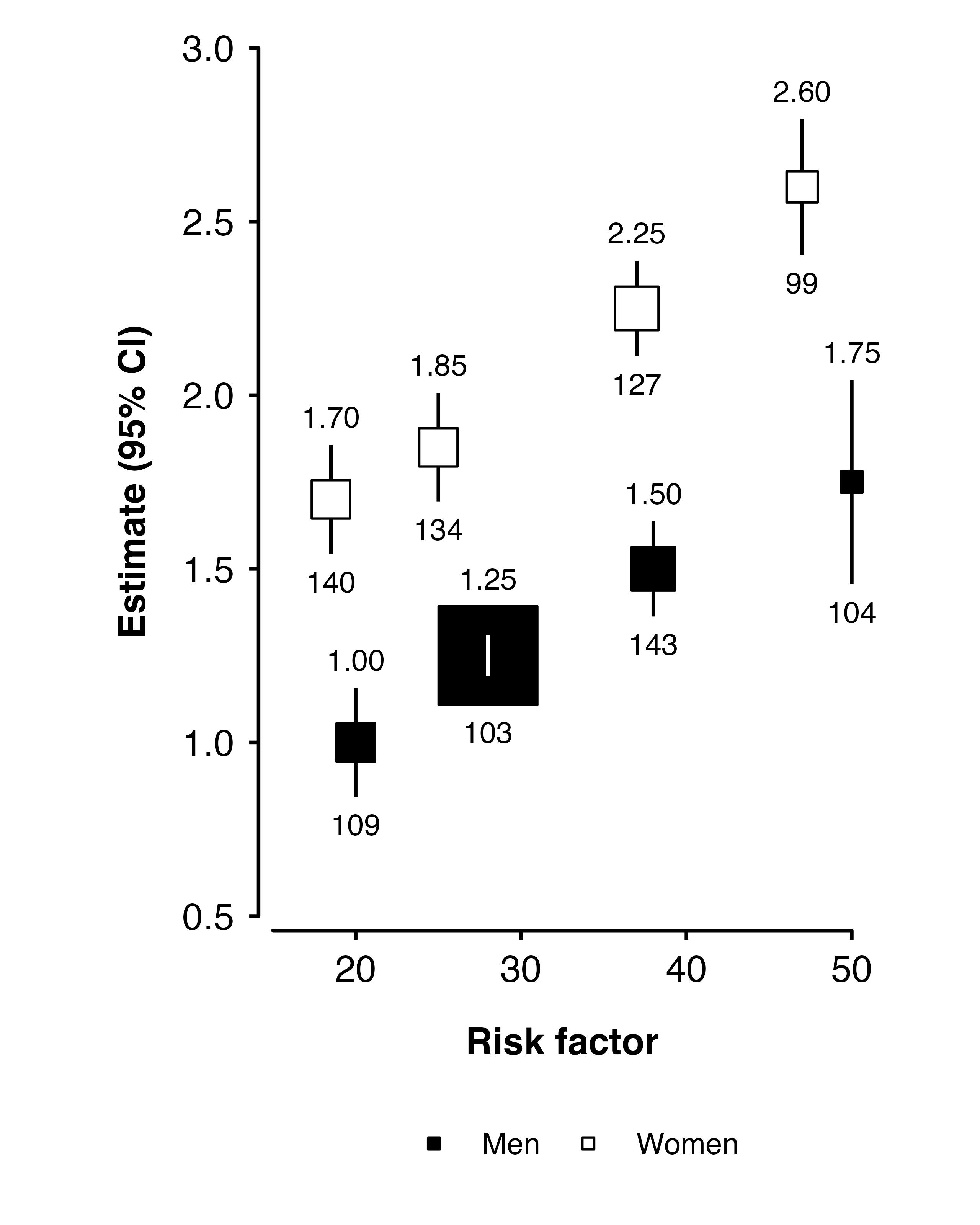
Using groups
You can use height with col.groups (but
then cicolour cannot be used ).
data_to_plot <- ckbplotr_shape_data %>%
  dplyr::mutate(is_female = factor(is_female,
                                   levels = c(0, 1),
                                   labels = c("Men", "Women")))

shape_plot(
  data_to_plot,
  col.x        = "rf",
  col.estimate = "est",
  col.stderr   = "se",
  col.n        = "n",
  col.group    = "is_female",
  xlims        = c(15,50),
  ylims        = c(0.5, 3),
  scalepoints  = TRUE,
  pointsize    = 15,
  height       = 90,
  addaes = list(estimates = "vjust = - 0.8 - as.numeric(narrowci) * 0.04 / se",
                n         = "vjust = 1.8 + as.numeric(narrowci) * 0.04 / se"),
  legend.position = "bottom")