+ ckb_style() does three things to a ggplot2 plot:
- applies a CKB theme (i.e. change the overall appearance)
- extends the plotting area and caps the axis lines (so that you can have a custom sized gap between the plotting area and the axes)
- applies a fixed aspect ratio
Examples with a scatter plot
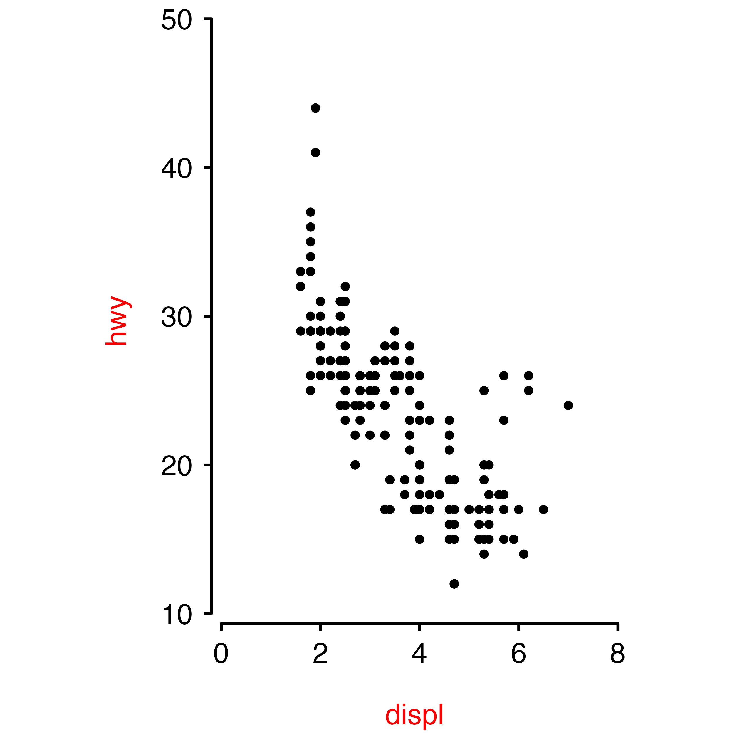
Make a scatter plot with ggplot.
plot <- ggplot(data = mpg, aes(x = displ, y = hwy)) + geom_point(size = 1)
plot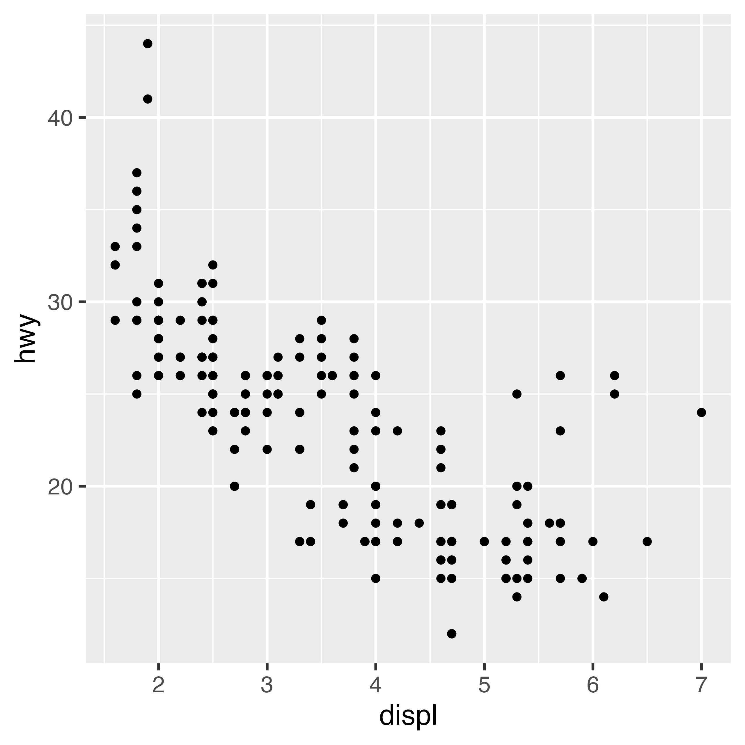
Use + ckb_style() to apply a CKB theme, cap axis lines
and fix the aspect ratio.
plot + ckb_style()
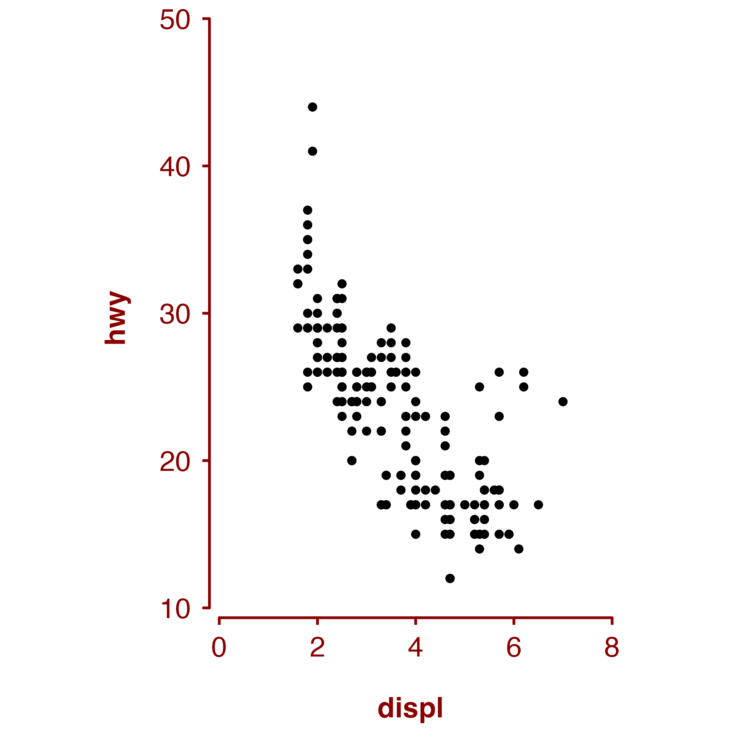
Or apply just a CKB theme.
plot + theme_ckb()


Aspect ratio and panel sizes
Change the aspect ratio of the plot.

Set the width of the plot (width controls the length of
the x axis).

Modifying the appearance of the plot
The ink and paper arguments of
theme_ckb() and ckb_style() can be used to
change the colours of the plot.
The plot.margin arguments of theme_ckb()
and ckb_style() can be used to adjust the margin around the
plot.

If you wish to override some aspect of the theme applied by
ckb_style() or theme_ckb(), then this can be
done by adding a theme after + ckb_style(),
plot + ckb_style(xlims = c(0, 8),
                 ylims = c(10, 50)) +
  theme(axis.title = element_text(colour = "red", face = "plain"))